Production and bringing together all the elements
Page layout
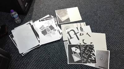
All of the designs were photocopied at A4 so that two could be placed side by side to create a double page spread on the photcopier. Working at A4 also meant it was easier to stick text and create the designs.
Two sets of prompts were printed off, one white on black and the other black on white to reflect the different backgrounds within the booklet. These were then cut up and stuck onto the corresponding design , making sure the backgrounds matched the background on the actual design. This meant that when photocopied it would look like the text had been within the original design.
It was found however that in some designs the text had to pasted over an element which would therefore show the background, however this it was thought would show insight into how the piece was made rather than it all being perfect.
On some of the pages including imagery there was not as much contrasting black and white to place the text on, so the the background for the text was determined by how much black or white there was within the image.
To separate the sections within the book title pages were added, which used only the headers in similar positioning to the prompts. The use of a blank background it was considered would create contrast next to the imagery within the book.
Booklet Production
Initially the design was going to be a coptic bound book however it was found that with the amount of pages it would probably be more effective to create a saddle stitch booklet. Creating a mock up of this, including the contents and title page meant that it was easier to visualise which designs would have to be potocopied together and on the back of one another on the photocopier
To create the booklet two designs were placed next to each other on the photocopier bed, making sure that the left design within the booklet was on the right handside of the photocopier when placed flat down.
Using the mock up during the process helped to keep track of the order of the book.
To create a double sided print and to use the chosen stock the multipurpose tray was used, which allowed paper to be fed in to the machine. When the first side had been printed the page was placed as it would be read into the multipurpose tray. Changing the design in the photocopier and printing again mean that the design was printed on the back. However during the process there were a few times when the designs were placed on the photocopier bed the wrong way round without knowing which led to the pages being printed the wrong way round , so it was important to check that all the pieces were put into the machine correctly.
When printing the designs the density on the photocopier was set to +3 to create strong black within the designs.
Organising the designs into double page spreads greatly helped when creating the booklet as it made it easier to find all the elements and made it easier to relate to the mock up that was being used to help.


No comments:
Post a Comment
Note: only a member of this blog may post a comment.