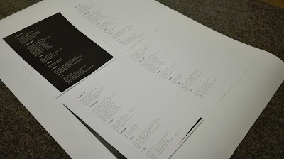
Cover and Contents
For both the cover and contents page the designs were kept simple using only typography and a block background. The contents of the booklet is quite busy so these more minimalist designs would contrast against the rest of the book, whilst looking consistent through the use of placement of the text and the use of Courier which coincides with the prompt typeface.
Contents
Within the crit it was suggested that a contents page would be needed for the categories within the book. The contents uses only Courier, as within the rest of the booklet, however the body text is left as regular and the headings of the categories are in bold to create contrast between information.The use of dashes next to the headings inset them slightly making it clearer visually that they are important. The design was then printed out and photocopied in a few ways. The design with the black background seemed quite heavy and dark for the contents page so it was decided that black text on a white background would be used. Photocopying this at an angle with the lid up let a black border show, giving the design a more consistent aesthetic with pages in the book without it detracting from the actual text.
Cover
Initially the design was created using a block of black for the background to reflect the contrast within the book in a clean and simple way. Positioning the title at the bottom of the page meant that this reflected where the prompts were placed within the rest of the book. The title and subheading both use Courier, however initially the title was bold to reflect the use of this on the headings within the booklet. This was also used to make the title stand out, however it was found that when the title was at this scale the typeface looked more curved and bulky than it did at smaller point sizes, which wasn't as attractive. Instead the title was left in regular so that it was less dominant and more refined on the cover. The book was titled 'process' as the contents of the book are mainly prompts around idea generation and simple techniques that can be used. The subheading of 'creative prompts and techniques' sums the book up well without the need for a blurb or description.
When the designs for the cover were inverted this created an interesting effect. The background became an off white colour, however smudges and marks could be seen within the block of colour. This it was considered created subtle texture which was imperfect and visually looked lie it had be used and handled , reflecting the creative process.
Testing the design on the paper used for the internal pages and another cream coloured paper created different results. When printed on the paper used for the pages it was found that the design had greater contrast between black and white, however on the other paper the design had a more aged feel and reflected the colour of one side of the internal pages. The black border created by the photocopier framed the design and created slight contrast as seen within the rest of the booklet.
It was decided that the inverted design would be used for the cover as the black one was too intense for the cover, especially when the contents of the book had heavy contrast within it. Using this more subtler design reflects the creative process and shows the 'makers marks' on the front. The typography although still in regular still stands out against the background.


No comments:
Post a Comment
Note: only a member of this blog may post a comment.