Cover Designs / Construction
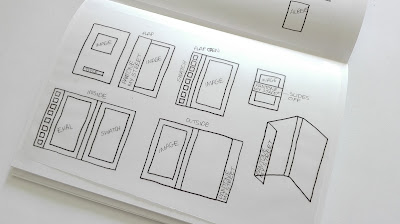
Taking inspiration from the FS Emeric type specimen it was considered whether a card cover with two flaps could fold around the contents of the booklet. Looking at the example it showed that if this was to be used there would have to be an extra bit of length in-between each side of the cover to compensate for the thickness of the contents within. Also folding the card would take length from the cover so extra would have to be added for this as well. When the flaps are opened the image would be on one side with the swatch on the other, separating the design from the rest of the more general information. In the same design it was considered that the pages of the booklet could be layered individually over one another , then stapled to create an industrial look. Using tracing paper for the pages would allow for the colour swatch to show through from each of the pages along one side. However this would also mean the text from each page would interfere with one another as they were layered and transparent.
It was also considered that the back section of the pages could be stapled to the main cover, with the other pages stitched using saddle stitch allowing the pages to turn as a book would.
Another option would be to create a traditional saddle stitch booklet with rectangular sections cut from it so that the colour swatch would show through from the inside page. Placing this on the right hand side of the cover would be more appropriate because if the cut away sections were on the left, where it would be stapled, the cover would be more fragile and possibly be more likely to break.
Another idea would be to cut brick like shapes from the front cover and have a full bleed image on the inside page. This would allow sections of the image to show through as well as making a link to the physical constriction of the buildings within the photograph.
A further consideration took inspiration from the Nest magazine which has a card flap allowing the inside page to be seen. Using this format, the title would be placed on the flap and then the swatch would be seen on the right hand side of the inside page. Within this design the pages would each have a swatch colour on it which would be visable from the the front cover by cutting rectangles through the pages allowing them to show through.
For the design with layered, stapled pages, if the information is broken down into its key categories then there should only be six pages, however the because Klein Blue has general information as well as Klein Blue examples and analysis, this would have to go over two pages. This could be made so that the page folds out from the main booklet.
A further design would reduce the size of the image and title creating a minimalist design.
The booklet could have a wrap around band with the title across it, which can be slipped off to look through the booklet. Having a full bleed image on the front cover of this design would allow bits of the image to be seen around the band.
Adapting the previous initial design of having a folded wrap around cover with two overlapping flaps, one of these flaps could be thinner like in other designs allowing the other card flap to show through, rather than being covered. Within this design the title would be on the thinner flap and the photograph would be on the other flap, which would be visible on the cover. On the inside of the flap the swatch would be placed. Opening up the cover an evaluation would be on the inside cover with the rest of the booklet stitched into the folded 'spine'.
Continuing with the inspiration from the Nest magazine and its cover flap, the title could be positioned length ways to make the most of the space, with a large copy of the image on the inside page, allowing a section of the image to be covered. In the inside of the flap the colour swatch would be positioned within this space, allowing a connection / comparison between the image and the swatch.


No comments:
Post a Comment
Note: only a member of this blog may post a comment.