Digitalising Designs
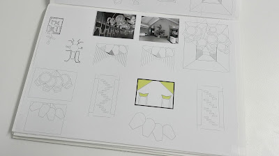
Using the initial drawings these were then digitalised so that they could be formed into a composition.
Using the pendulums within the designs was particularly hard because of the layering needed and the perspectives that were involved. Also the repetitive lines within the mirror were hard to get right because of the need to show distance aswell as layers of repetition.
Within Brodsky and Utkins work their plan diagrams used contrasting thick and thin strokes to show different walls. Using this idea the diagrams were adjusted so that there were thicker strokes to define areas and show main partitions. Filling areas also created a better sense of space by separating accessible areas and void areas.
Using block colour and contrasting line weights within all of the images meant that there was some consistency across diagrams when placed together in a composition. The pendulums in one of the designs was not as accurate as hoped. The images had slightly different aesthetics to each other meaning they don't quite work together as one. This could be improved if there was greater balance between filled areas in all of the images.


No comments:
Post a Comment
Note: only a member of this blog may post a comment.