Wayfinding
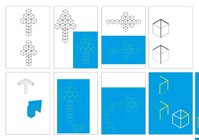
Initially we were shown arrows that used the isometric grid to create arrows out of the cubes. These worked well in creating a three dimensional appearance however it was said that possibly they were too complicated and the the line thickness had to be increased especially on the yellow designs to help them stand out against the CMYK Cyan background.
Instead it was suggested to Theo that we could use a singular block as a wayfinding element because of the angles and lines within it. Using the closed block designs were create in both a black / white scheme and a scheme using our colours which tied better with the overall concept.
The line thicknesses within this design were still thinner than the original blocks so these were increased to better reflect the cubes. However when both the arrows and cube line were the same thickness this led to them merging a little and not being as distinct.
It was suggested that perhaps the empty box could be used instead to allow for a greater amount of directional possibilities and that the extra lines of the cube should be dashed to allow the arrows to stand out more. The ends of the arrows were made to fit the angles of the cubes to make the design look cleaner.


No comments:
Post a Comment
Note: only a member of this blog may post a comment.