Friday, 19 May 2017

OUGD406 - End of Module Evaluation

Module Evaluation

Within this module, it has been interesting to work on live briefs both within the Penguin Student Design Awards and the exhibition branding. With the book covers it was interesting to see how the shortlisted entries compared to the design I created as well as what other people were producing within the class. The exhibition branding brief was more intensive to work on because there were so many elements and the design needed to be professionally done and consistent to best reflect the work within the show.

Working within a team for the exhibition branding was particularly difficult mainly due to attendance which made the process much slower and meant we were behind other groups for most of the project. However, the final outcome was effective and the presentations went well.

Within the module, I have found that I have developed my presentation skills on from the PPP module. Myself and another group member presented the branding within the final crit and did the pitch to the second years which was possibly a larger group to present to compared to the self - branding presentation we did in PPP. Although I still get nervous when presenting I appear to be more relaxed when presenting, however there are still times when I lose track and it feels like I'm waffling. I’m glad I did the presentations even though I didn’t want to , because it made sense for the two people who knew the branding best to pitch, as this was more likely to show the branding in the best light.

The module became quite hard to keep track of towards the end because of the amount of time the branding project took up, which meant that I only really had a week to physically create and design for Studio Brief 4 making it a rush to complete the last task. However, the outcome for Studio Brief 4 was effective and overall the project was quite fun and free to work on compared with other briefs within the module.

Having overlapping briefs made it difficult to keep on track and up to date with the different projects, however this will become more common next year so time management and working on briefs evenly will hopefully help with this.

The print exhibition was the following week after hand in, which added further strain, especially when organising to do things for the exhibition when people were trying to catch up with work for hand in, meaning there wasn’t a lot of time to organise the exhibition. However, being part of th­­­e exhibition management means there will be a sense of achievement when the exhibition goes up and I am looking forward to seeing the finished thing. Curating the exhibition is an­ interesting task as I am quite methodical in my approach to problems and good at planning things out, also I like the hands-on task of actually putting the exhibition up.


Doing design boards after each of the briefs was finished meant there was less to do at the end of the module. If these had been left it would have been physically impossible to do this alongside creating and documenting Studio Brief 4 as well as set up the exhibition.

Studio Brief 4 - Binding

Decisions on binding 

To bind the book it was considered that the booklet should be stitched rather than stapled to continue with the handmade DIY approach to the contents of the book.


The book was initially bound using a grey/ blue coloured thread which was similar to the tone on the front  cover creating consistency and allowing the thread no to detract from the cover. However it was found that when the book was stitched the binding was quite bulky and stood out. Instead fishing wire was used for the binding because it was transparent and thin so did not detract from the minimal front cover. 

The creep on the pages was left uncut to create a feeling of unfinish reflecting the overall aesthetic of the book which was not perfect. 


Studio Brief 4 - Making the booklet

Production and bringing together all the elements

Page layout 


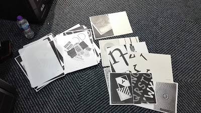
All of the designs were photocopied at A4 so that two could be placed side by side to create a double page spread on the photcopier. Working at A4 also meant it was easier to stick text and create the designs. 


Two sets of prompts were printed off, one white on black and the other black on white to reflect the different backgrounds within the booklet. These were then cut up and stuck onto the corresponding design , making sure the backgrounds matched the background on the actual design. This meant that when photocopied it would look like the text had been within the original design.


It was found however that in some designs the text had to pasted over an element which would therefore show the background, however this it was thought would show insight into how the piece was made rather than it all being perfect.


On some of the pages including imagery there was not as much contrasting black and white to place the text on, so the the background for the text was determined by how much black or white there was within the image.


To separate the sections within the book title pages were added, which used only the headers in similar positioning to the prompts. The use of a blank background it was considered would create contrast next to  the imagery within the book. 


Booklet Production 


Initially the design was going to be a coptic bound book however it was found that with the amount of pages it would probably be more effective to create a saddle stitch booklet. Creating a mock up of this, including the contents and title page meant that it was easier to visualise which designs would have to be potocopied together and on the back of one another on the photocopier


To create the booklet two designs were placed next to each other on the photocopier bed, making sure that the left design within the booklet was on the right handside of the photocopier when placed flat down. 


Using the mock up during the process helped to keep track of the order of the book.


To create a double sided print and to use the chosen stock the multipurpose tray was used, which allowed paper to be fed in to the machine. When the first side had been printed the page was placed as it would be read into the multipurpose tray. Changing the design in the photocopier and printing again mean that the design was printed on the back. However during the process there were a few times when the designs were placed on the photocopier bed the wrong way round without knowing which led to the pages being printed the wrong way round , so it was important to check that all the pieces were put into the machine correctly.


When printing the designs the density on the photocopier was set to +3 to create strong black within the designs.


Organising the designs into double page spreads greatly helped when creating the booklet as it made it easier to find all the elements and made it easier to relate to the mock up that was being used to help.  

Studio Brief 4 - Final Crit

Crit Feedback 

Final Outcome


Crit 

Within the crit it was said that the finished product looked like something that would be bought. It was also said that the booklet was informative and useful and that they would have liked to have had a copy of it at the start of the year. It was said that the simplicity of the design was effective with less text and more imagery. It was said that the use of only black and white photocopied prints would make the outcome inexpensive to mass produce. It was questioned whether the contents page was supposed to be wonky however this was deliberately done to reflect the other angled photocopies within the book. To make this link further possibly some black background could be introduced into the contents page by re-positioning it on the photocopier bed, creating consistency across the image pages and the contents. It was also said that the design was really consistent and used an appropriate typeface. It was also suggested that perhaps a section on sketchbooks could be added explaining the importance of them. It was said this could be achieved using a series of sketches. 


Thursday, 18 May 2017

Studio Brief 4 - Initial ideas for Concept

Ideas based on creative prompts concept

Prompt Booklet 

The booklet would include short prompts, based on techniques and approaches we have learnt throughout the year. This would be useful during projects and would act as a reference for the user. With the prompts mainly focusing on processes, techniques and approaches the book will be created in an experimental way. Using Experimental Jetset's 'Statement and Counter - Statement' as visual reference the book will be produced on the photocopier. The design of their book uses snippets of their work and was produced using a scanner which creates a consistent aesthetic throughout the book. Using the photocopier to produce the book will reflect the experimental nature of the content of the book, whilst communicating a sense of an unfinished product much like the generation of initial ideas and concepts. The DIY feel to the booklet will not be perfect but will focus on showing a process.

The use of large images within Experimental Jetsets book are visually engaging and this is something to be explored with the design of the book. Potentially the page designs could use full scale images as backgrounds with the prompts being featured quite small allowing the imagery to dominate. The imagery could possibly only feature pieces of work produced throughout the year, however it was  decided that this may be too suggestive to the user as to how to approach the prompt. Some examples may be necessary however the whole of the content should not be. It was also considered that only physical materials that are associated with the prompt should be used as background imagery e.g. drawing with tape would feature only tape. By doing this the background takes on texture which is visually interesting however is not overly influencing in how an outcome should look. Combining these images with the prompts , but making the prompts small, like footnotes, would suggest they are only possibilities and that they can be adapted and even overlooked if not effective in the situation.


Prompts with flip pages

This idea would be formatted so that the book is broken into four sections with the pages for each section being separate allowing them to be turned individually. The top section would have the prompts , whilst the other sections would be shape, word and material. These three categories frequently came up within the survey and when looking back at previous work so these were the most appropriate groupings and allowed for a wide range of things to fit within the categories. Shape would include physical shapes, word would include verbs , adjectives and nouns and materials would be easily available items. The prompt would be flipped and would include reference to one of the other cards, with the outcome then placed back into the prompt to produce a task e.g. Create a letter from a 'shape', then shape card would be turned and this would finish the answer. With the visuals for the material cards it was considered these could use bits of the materials they reference. The word cards would be strips of paper , whilst the shape ones would be only graphic shapes. This however would mean that there would be a different aesthetic within each flip section which would could look inconsistent. 


Prompt Cards 

The final concept would use four piles of cards, material, adjective, verb and noun. When using the cards on of the adjectives, verbs or nouns would be picked up and a material card would also be taken. The material would then be used to create the noun, adjective or verb or the noun, adjective or verb could be applied tot he material. Multiple outcomes would be encouraged to enable idea generation and problem solving. The game could be further developed by taking a card from two of the piles and a material card (e.g. a verb (twist) and noun (tea) card) which would then need to be visualised in a range of ways. Similarly picking up an adjective and noun would work in the same way. Picking up multiple cards would allow for more restriction which would increase the complexity of producing the outcome.     

Studio Brief 4 - Adding type

Type choices

Initially OCR A Extended and Ariel were used on some photocopy experiments. OCR A Extended was supposed to reflect a DIY approach and traditional feel, whilst Ariel is a clean typeface that would contrast well against the sometimes busy imagery. 


The type was cut out from either a black on white set of text or white on black, then stuck onto the sheets to be re photocopied. Using the type with the corresponding background colour allowed the type to look as though it had been printed with the image. In other experiments the opposite background was put on an image creating contrast between elements and showing the process of the books creation. Placing the text in either of the bottom corners seemed to be the most effective and would enable some consistency across pages. 


Using OCR A Extended was effective in creating a DIY feel, whereas Ariel felt too clean in comparison to the imagery. However it was considered that OCR A Extended looked a little digital as well so similar alternatives were considered. 


Lucinda Console, Consolas and Courier were all found to have similar characteristics.  Lucinda Console has rounded terminals which felt a little too playful and possibly even childish. Consolas had squarer terminals however the type was lighter in weight. It was tested in bold  which made it a similar weigh the other type examples making it clearer. Courier was found to be the most like OCR A Extended as it had serifs to finish off the letterforms and emphasise their structure. The spacing between letters was wider, which it was considered would allow for greater legibility when scaled down, when compared with the other typefaces, which had much tighter tracking.

Studio Brief 4 - Interim Crit

Crit


During the crit the group were asked whether they thought that the whole book should photocopied in black and white or include some colour as had been done in some of the mock up pages shown. It was suggested that it would be effective to have the whole publication in black and white, however someone also suggested that perhaps it could be photocopied on different types of paper e.g. neon paper. It was suggested that there could be different sections within the book with the prompts split into categories such as colour, photography, 3D etc. It was suggested that the different sections could potentially be differently coloured to show them visually. It was said that a contents page could be useful and should include a brief description of the purpose of the book to make it clear to the reader. As a title Handbook was suggested and it was also said that this booklet could potentially be more useful to the first years than any other information they receive at the beginning of the year, so the title would reflect / suggest how its something they would continue to come back to and use.

Other tasks that were suggested were: 
- Find a vibrating boundary
- Find a complementary colour
- draw with something else
- paint with fruit
- paint form taste
- find type 
- make a pinhole camera


Moving forward

After the crit it was decided that the book would focus mainly on ways of working i.e. processes and techniques, as these are more like prompts rather than whole tasks. Providing prompts will help people with a variety of briefs and they are more likely to be used as a reference rather than something they do once and don't come back to. With this in mind the phrasing of the prompts will have to be quite vague to allow for them to be interpreted and used in a wide context. Imagery that is used for the backgrounds should illustrate the prompt but should not suggest too much how something should be done as this could prevent the user from thinking and applying the prompts to things in their own way. 

Studio Brief 4 - Page Designs

Page Variations 

Once the concepts for each of the pages were decided variations of the designs were tested to produce the final designs.


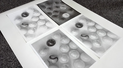
'Photocopy to invert' used an image from the object brief and was chosen because of the circular shape of the mark. To suggest inversion the mark would be cut in two with one half inverted to white and the other black, reflecting the contrast between the two settings. To create this part of one of the images would be collaged onto the other to produce a combined image. The designs with the mark in the top left corner will be the most effective because this will look balanced when the type is placed at the bottom of the page.
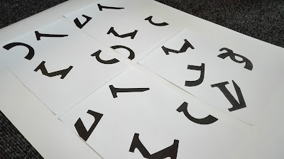


To create 'cut and rearrange letterforms' letters from the same typeface were cut up and scattered onto the photocopier. Enlarging a section of the bed meant that the letters were larger and more in keeping with the size of the imagery within the other designs. It was found that in some part of the letters e.g the Q, where the middle section had been cut out with a knife the rough edge of the cut was made obvious when enlarged. Letters that were cut using scissors were only used as this created a clean cut that was more effective when enlarged. 
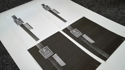


For 'photograph existing type' a picture of a sign was used as this was considered one of the most obvious sources of type. This, it was thought would make people look for more obscure sources if that was already suggested to them. It also shows that type can be found in everyday situations, all around us if the time is taken to look, providing inspiration. The sign and lamp post was cut out from an image from the wayfinding project then photocopied on a white background and with the lid up to create a dark background. The white background created the most contrast, whereas the black background seemed to blur with the image. Positioning the image on the left of the page also played with the phrase 'look right' which you would do to see the prompt in the bottom right corner of the page.  
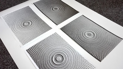


This image for 'photograph using a restriction' was taken during the object brief and could suggest a restriction of pattern, central alignment or circles. This provides a few suggestions in tackling the approach, within one image. Heightening the contrast on the design made the image stand out more, whilst inverting it created a infrared look.
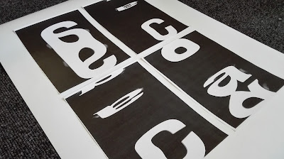
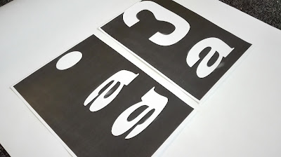


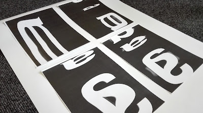
The previous experimentation for 'photocopy to distort' was not as successful as anticipated so a new set of images were created. Using an 'a' which is naturally a more distinct letterform than a 'd' led to some interesting results. It was found that if the letter was dragged backwards and forwards over the scanning bar in the same direction as it was moving, created more elongated and compact variations of the letterform, Also this allowed the merging of the letterforms which created some interesting results which were more reflective of the outcomes that could be produced with the technique. Within some of the designs however you can see where the letter has been held, so when these are used this would have to be blacked out. 


The photograph for 'find, make and photograph objects' was taken from Studio Brief 1 and shows how objects can be arranged to tell a story, The image is quite abstract allowing for interpretation and uses very accessible objects showing that simple items can communicate meaning. The design when photocopied originally didn't have much contrast so this was altered by heightening the background on the photocopier.  


'Combining letterforms' uses the ligature we created in pairs. When photocopied scale was experimented with however there was still a lot of white background. To keep consistent with other designs the image was re - photocopied at an angle with the lid up to create sections of black similar to other pages. 


'Make letters out of materials' uses an experiment using blue tac, from the beginning of the year.  This design shows how very simple materials can be adapted to create typography. The design was initially photocopied to zoom into a singular letter however, because of the amount it had to be magnified by, meant that the design lost its sharpness. This meant a design with more letters within in was created. 


'Make drawing tools' shows fragments of markmaking created with tools in the blackletter project.


For 'research definitions' and 'research synonyms' pages from the dictionary would be photocopied showing the definitions of these two words. These could be altered by drawing circles around the definitions highlighting the actual words.


To reflect 'photocopy to reduce' a letter was minimised as far as possible on the photocopier. This would then have to be re- photocopied with the lid up to create an A4 background of black.


'Photocopy to enlarge' was create using the reverse of this technique. The left design was more effective as it showed more of the characteristics of the 'G'.


'Collect interesting design' uses a symbol from some packaging. When photocopied the design was most effective with a black background as it created the greatest contrast and allowed the symbol to stand out more. The slight creased texture of the symbol has also been captured creating contrast between flat block colour and tone in the creases.


'Adapt cheap materials' uses items that can be found in stationary shops and that are inexpensive and easy to come by, whilst being versatile. When these materials were photocopied it was found that the detail within the items was emphasised by an almost glowing effect.


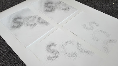
To reflect 'use a verb to create a letterform' this example shows how cutting into a preexisting letterform template can create a new design. The original type has become something new through the process of applying an action. To photocopy this black chalk was rubbed into the scratches to help them show up, however this also left smears which were seen in the photocopy. Inverting the design so that there was a black background meant that the background was much cleaner. 


'Collage with offcuts' used found scraps which were arranged on the photocopier. The designs were most effective when on a black background as it created the greatest contrast between the elements.


'Print with found materials' uses  print that was created in the wayfinding brief  which created a texture using straw.


Originally an offcut of a design was going to be used for 'draw with continuous lines' however when photocopied it became pixelated. Instead different types of pens were used to create various lines. These were photocopied with increased sharpness and contrast to create crisp looking lines despite being magnified.


For 'photocopy to layer' a simple circle was photocopied once then moved and re-photocopied over the same image creating overlap in the shapes. This created quite dark image so this was inverted to show a lighter version.