Pattern Development
Using the Photographs of bark
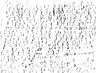
- The rubbings that were taken of different trees bark did not always show the visual patterns that the bark had.
- Using the imagery collected of each of the trees the different shapes and elements from the bark were outlined using the pen tool.
- For the Douglas Fur the rounded bark shapes were its most distinctive feature combined with the pink and purple tones of the bark.
- Outlining the shapes within the bark created designs that were representative of the bark however were abstract in their appearance.
- Colour swatching colours from the image allowed the pink and purple tones to be captured from the bark
- The different shapes were filled with the colour that matched the colour of the area within the image. By doing this it represented the patternation and colouration of the bark but in a simpler, bolder and more refined way.
- Picking a set of five colours allowed the colour pallette to be more cohesive and refined, rather than using lots of different colours.
- With this tree the most defining feature was the stripes of knots on the trunk of the tree.
- The knots on the tree were raised and rough which created shadows and darker areas within the image. To reflect this texture within the composition the dark patches within these knots were outlined.
- Outlining these areas was effective in some instances, however in some areas the lines created didn't fit with the rest of shapey aesthetic within the design and also when compared to the other patterns created with used only block shapes, with little detail.
- Within this composition none of the shapes overlapped on interacted with one another like they did in the other compositions. Instead they all sat on a flat could background which perhaps made this design more simple than the others.
- It was considered that a shape could be added to the background to reflect the slight shadowing on area of the tree trunk facing away from the sun.
- The addition of this shape with the other background colour made the composition look fuller and more like the other two designs and allowed more interaction between elements within the design.
- Getting rid of the darker areas within the 'knot' areas and leaving them as solid shapes worked better within the composition and was more in keeping with the rest of the design.
- This tree had a very flat texture, however had some interesting doppled patternation on the bark which was the main feature of the tree.
- At first glace the tree looked to have a yellowy brown colour palette however there was an interesting darker area which had some dark blues and greys which contrasted well against the lighter browns from the doppled areas.
- Using the colour pallette swatch from the image these colours were then applied to the areas that they corresponded with.
Using the Bark Rubbings
- Each of the rubbings were scanned in to be used digitally as patterns.
- Scanning the rubbings in then using image trace on Illustrator allowed the rubbings to be digitalised however this did not allow all of the details to come out from the rubbings, instead it simplified the shapes and made them look more blob like which was not wanted.
- To create a more refined representation of the rubbings the designs were drawn over onto tracing paper.
- It was found that filling the shapes in with black then scanning them in allowed the Image trace tool to see them as whole shapes. When only the outlines of the shapes were drawn then scanned and image traced the shapes created followed the path of the outline rather than allowing the shape to be filled.
- Drawing the designs then scanning them in to the computer created cleaner designs as the extra marks within the rubbings were ignored.
- Combining both the shapes and colours picked from the bark created camouflage like compositions that would work well in blending with the tree if mounted on the tree it was based on.
- Potentially however the patterns created have too much of a camouflage aesthetic and would be associated with this style which may put some people off buying them.
- Alternative to the colour designs it was considered that the drawings could be stripped back to use only the shapes within the pattern creating a line drawing of the texture of the bark.
- this would still reflect the different forms within the bark in a simple way and allow the focus to be on the forms and shapes that make the different bark samples distinctive
- as the design is only made from lines it was considered that the lines could be made different thicknesses to create depth within the pattern as well as to reflect the shadowing and more distinctive parts of the barks texture and colouration


No comments:
Post a Comment
Note: only a member of this blog may post a comment.