Existing Designs
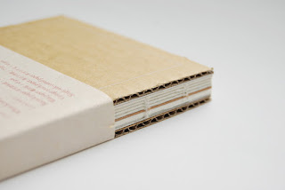
Notebook dedicated to stamps
- the minimal use of design elements on the front cover allows the material textures of the covers to be the focus of the design, with the rectangle almost framing the cover
- using a stamp on the cover is more environmentally effective as the design uses less ink and doesn't need a printer only the stamp which can be reused over and over again
- This also makes the printing process more versatile as the design can be easily transferred onto materials that would be too thick to go through a conventional printer
- using different materials for the covers of the books highlights the focus of the project as being on the materials in which the books are made from
- the use of the cardboard and greyboard as covers gives the books a more natural feel suggesting a sustainable aspect.
- using coptic stitch on the spine allows the papers inside to be seen, again placing focus on these materials and continuing the minimal aesthetic seen in the rest of the book
- the exposed binding on this book allows the colours of the different papers within to contrast nicely against the more neutral cover materials
- perforations within the covers allow the books to be adapted and allow the user to personalise their book
G.F. Smith Paper Sampler
- the main focus of any G.F Smith collateral is to place the paper and its versatility at the heart of the design
- the use of the coptic binding within the design allows all the papers to be seen within the book, whilst the use of the different tabs on the front of the book also reinforces this sense of the variety of papers on offer from G.F Smith.
- The use of the tabs also allow people to easily navigate to the page / colour they want to go to, providing a snapshot of the contents of the book
- text within the design is kept to a minimum again allowing the quality, colour and texture of the paper to be the focus within the design
- each book has a different combination of papers creating a sense of uniqueness whilst also creating a sense of the papers adaptability and different combinations they can be used in.
- The size of the G.F Smith catalogue makes it a design object that designers want to keep
- the use of the fabric binding on the book is a simple way of joining all the pages effectively and allowing the book to open fully so the different papers can be seen as sheets. The use of this bind means that it does not interfere with or compromise the papers within (e.g. the paper can lay flat rather than being folded which creates a more refined design).
- ordering the papers in terms of range within the book allows clear distinctions to be made as to where the different sections start and finish just by looking at the side of the book.
- Tabs within the book also highlight this and help to separate the different sections within the book
- The extract range of paper uses coffee cups as the key ingredient within the production of 16 papers, combining sustainability and quality
- the design of the book uses varying shaped pieces of the papers overlapped and folded together, which allows all the different papers to be seen from the outside of the book, whilst the overlapping allows different colour combinations to be seen
- the use of the varying sized and shaped pieces of paper creates a sense of them being scrap material which reflects the origins of the coffee cups which were waste
- This scrap aesthetic is made contemporary through the use of the bright papers whilst the geometrically cut papers create a more refined feel to the design
Bad Books
- Badbooks creates journals / travel books made from different types of papers and materials.
- most of the pages are neutral and unlined to allow them to be used however the user wants
- Many of the papers have an element of sustainability such as being salvaged, being recycled (e.g. elephant poo paper)
- some of the books have a colour which runs through some pages within the book and ties with the inside cover / cover colour in some way
- different weights and qualities of papers are used within the book making them tactile
- each book uses a different layout and assortment of papers making each of them unique
- the use of varying sized papers and edges (e.g. the inclusion of the wholes in notebook paper) creates interest within the book
- the use of mainly plain papers allows the user freedom on how to use the book and makes them suitable for writing, sticking things in and drawing / sketching
https://www.itsnicethat.com/news/gf-smith-extract-disposable-paper-cups-081117
http://plentyofcolour.com/2012/07/05/gfsmith-paper-sampler/
https://www.behance.net/gallery/33997562/Notebook-Delicated-to-Stamp
https://www.etsy.com/uk/shop/badbooks?ref=search_shop_redirect


No comments:
Post a Comment
Note: only a member of this blog may post a comment.