Evaluation Against the Brief
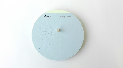
The passage of the year is communicated through the shape of the design which is a physical representation of the Earth and how sunlight effects the seasons on the planet. The seasons are created by Earths rotation around the Sun and the amount of sunlight that hits the planet at different points during the year. The removable weeks within the design allows the year to physically decrease which allows a sense of how much time there is left in the year. Feedback suggested to improve the design there could be another circle with the overarching concept on it to make it clearer to the audience.
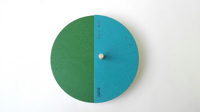
Colour is used to reflect the seasons with the palette being influenced by seasonal imagery. Common colours from this swatched palette were then matched to the Colourplan papers, with each season being represented by three colours and every month having its own colour. The last colour in each season is also part of the next seasons palette creating a gradual change in colour between seasons. Feedback suggested seperating each season with another circle could help better define the individual seasons.
The calendar is fuctional and can be used as both a calendar and memo pad, with the lines next to each date making it suitable for writing notes and encouraging it to be used as a practical memo pad. The design is suitable for display on a desk as it is not too big so wouldn't take up too much room, whilst the clean and minimal design of the calendar creates an aesthetic object.
The design has an innovative structure that is interactive with the user physically engaging with the piece. The circular shape is reflective of the Earths shape as well as G . F Smiths 'chip' swatches that they use for colour selection linking it back to existing material. The stacking of the papers allows the colours to be seen from the side creating a gradual change in colour. However the use of the lasercutter has slightly dulled the effect of the paper, also if the design had been a daily calendar this would have emphasised the different colours further making the design more impressive.


No comments:
Post a Comment
Note: only a member of this blog may post a comment.