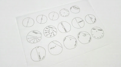
Type Layout for Weekly Page
Initially it was considered that the design could have a tear off section which would reveal the next coloured paper underneath, this would also reference other promotional material that G . F Smith have produced. It was thought that the tear off section could act as a notes page or as a paper sampler however the shapes vary meaning there wouldn't be enough space on some of the pieces to write much on. The front design could have a section of the card that folds over to reveal the colour underneath which would make reference to the G.F Smith logo / branding. Originally the design was going to be a monthly design with all of the days of the month on each design. These would either follow the curvature of the circle or the straight line of the cut off section. This however wouldn't be very practical as you would only be able to mark off the days rather than be able to write anything. Layering the different shaped pieces of card on top of each other in a particular way will allow the colour underneath to create the background of the shape above without being able to see the any of the text etc from the design underneath. The arrangement of the pieces would be important to make the design work for each month. Refining the design down to a weekly calendar will allow more space on each piece to write notes etc.
Making the design more functional
The numbers for the days of the week could follow the curvature of the design replicating the different positions the Earth is at around the Sun for each month. The numbers could also circle around the central pin however there may not be enough room for all of the numbers. Placing the type along the line of the cut off section will allow more space for the paper to be used as a memo pad.It was considered that the type for each day could radiate around the central hole in straight lines which people could then write things that they were doing on that day underneath. Using just numbers around the central hole or curved section of the design would allow the rest of the design to be free to use as a memo pad. The layout of the type would follow a radiating circle layout to reflect the different points that the Earth is at points during the year. However it was found that this wouldn't leave much space for someone to write.
The design could perhaps be a daily calendar with the dots radiating around the curve which could act as 'To do' bullet points.
It was considered that each of the combinations of colours within the design have to be viewed at a certain angles to reflect where the light hits the Earth at different points. It was thought that the type could be laid out for each month so that the viewer has to turn the calendar to read the text, this would also mean the design would be turned to a certain angle making each of the monthly designs. This could either be the month or the way the individual numbers are positioned around the curve.
Months will overlap, so weeks where there are days for two months within them, it was thought could be repeated, so that only the dates for the relevant months are shown in each. Dots would then be used to represent the days of the week that were in the previous month.
The order of the numbers should circle clockwise around the design to reflect how the seasons start to the right of the Sun and circle clockwise around it.
Having dashed lines radiating from the centre point to the numbers for each week could act as lines to write on making it more obvious its a memo pad.
Joining the pieces together
To join all of the pieces a piece of dowel will go through the centre so there will need to be a hole in each of the pieces of paper. It was considered that the hole could go directly through the centre of all the designs however it was found that this wouldn't work for the half and half designs as the hole would overlap on the edge so it would fall out. The position of the hole could reflect the position of the Earth around the Sun for that particular month, however it was found for some months the hole would have to be off the piece of paper. A piece of dowel or clear acrylic could be used for the central rod. Having the dowel means each of the designs doesn't need to be perforated to be removed instead they can slide off.


No comments:
Post a Comment
Note: only a member of this blog may post a comment.