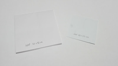
Format sizes for different elements
It was considered that to follow with the branding an the idea of a square patch / area, all the printed collateral should be made to fit a square format creating consistency across the whole range of designs.
Mock ups
Mockups were created for each of the elements within the adoption pack to allow for a better visualisation of the sizing's of the different items.
The overall size of the pack it was decided would be 20 x 20 cm which was just under the width of an A4 sheet of paper which is a common width for other adoption packs. Many of the items within the member adoption pack would be quite small so it was thought that this would be compact enough to hold the contents of the pack. Working from this initial size meant the other formats could be dictated based on this overall measurement.
Folders for adoption packs often have a section that holds all the items in place. For the folder it was considered that having a square section to hold the pieces within would either be too small to support all the items inside or would cover the contents when the folder was opened. Instead it was thought that the folder should have a triangular section as this would allow the items within to be half seen within.
A net for this was created with the extra folder section added on with the width of this being the same as the spine of the folder to allow for it to fold evenly.
When this was printed out and constructed it was found that the small extra flaps on the folder section were not needed as this section would support the contents when made from a strong stock and folded well.
The net for the seed packet would also fold to create a square design.
The newsletter it was considered would need to be the largest sized item within the pack as this would have the most content. Each section would be across a double spread so the sizing would dictate how many articles etc would be featured in a section. The certificate would also follow this size as this needed to be something substantial and something that people would want to keep so the size would show its importance.
The seed packet would be made 10 x 10 cm as this would only be holding seeds within however there would need to be information on the planting of the seeds on the back.
Map Formats
The layout and format of the map would dictate how large the design would need to be in order to fit all the content within it which would include a map, front and back page and a small section of information about some of the patches on the map.It was considered that the design could be a concertina format so that the locations could be on one side and a map on the other. However in this format the map would have to be quite long which might not be effective depending on the section of the map of Leeds that is used on one side as the patch locations may not all fit on.
Making a booklet with brief information about each of the places with a double page spread map in the middle would create a compact format that would be effective for all the relevant content as well as having a back and front cover.
Having a square double sided map it was thought would allow the map area to be more functional, however the size of the square would need to be quite large to allow all the content to be legible, which would then make it impractical to carry around.
Using the previous format it was thought that this could be folded down to make it more appropriate for travelling with as it would be smaller. Folding it down would allow for a front and back cover to be created, a large square map and information about some of the places on the map. It was decided that this format would be the most appropriate for the map as it was the most functional and could fold out to be whatever size was needed making it adaptable for the content. The folding of the design would need to be considered however as that content layout would be dictated by where it folds and how it folds down.
It was considered initially that the design could be 20 x 20 cm when unfolded so 10 x 10 cm when folded down which would make the design compact and able to fit in a pocket, however there were concerns over how much content would fit within this as one side would be taken up by the map and half of the other side by the front and back covers leaving half of a side for the information about the patches. With this in mind it was considered that a 30 x 30cm (15 x 15cm when folded) map should also be tested to see whether the extras space would be needed for all the content.


No comments:
Post a Comment
Note: only a member of this blog may post a comment.