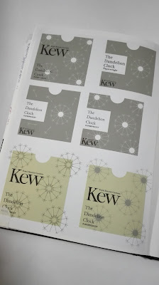
Dandelion Paperweight Packaging
Using the design created to represent a Dandelion seed head
on Word, packaging for a paperweight has been explored. This design will form
the basis of the packaging. During research it was found that a dandelion seed
head was called a dandelion clock. Kew Gardens sell dandelion paperweights
which encapsulate the full seed head. The packaging currently, is standard Kew
garden branded boxes which do not reflect the product.
Initial experiments explored the placing of elements and
allowed for the appropriate information to be picked for the packaging.
Originally the logo for Kew gardens was sized to be the largest thing in the
design, however it was decided that the title of the product needed to be similar
inside at least because this information is just as important. Having a central
strip across the packaging works well however, it needs to be minimised so that
the design behind can be seen more. The colour scheme was taken from a swatch
off a dandelion image. Using a serif
typeface works well in complementing the Kew logo.
 |
| Google image |
Applying a colour to the
background with the design in white evokes a greater sense of a dandelion seed
head which is naturally white itself. Reducing the text into a box creates a
sense of space which the dandelion seeds can float through. The subtle colour
scheme of grey and white combined with thin lines in the design create a sense
of delicacy.
Using a single background colour with a coloured design on
top worked well in creating a contemporary minimal look to the overall design.
Black text could be placed over this and still be visible however there was not
as much of a contrast between the grey and black as there was with the green
and black. This problem was solved by placing the text over a white box making
it much clearer. Combining multiple dandelion symbols together in one design
created more of a surface pattern which looked too cluttered and busy for the
delicate object the packaging was for.
To further minimise the design only one dandelion was used
as a central element. The dandelion was added to by layering smaller versions
over the original. This created a more three dimension and fuller seed head.
Reducing the size of logo and putting this at the bottom of the design meant
that the dandelion and title typography were central and the main focus of the
design. Making the dandelion symbol so that it was a variant of the background
colour created a subtle difference in tone which evokes a sense of subtly and delicacy whilst still reflecting the intricacy of the seed head. Refining
the dandelion symbol so that the middle is a block colour will simplify the
design and make it look less clumsy in the centre. Baskerville as the typeface
works well in complementing the design and creating a traditional and refined
look to the packaging.
The net of the packaging forms a simple square box with a
lip so that the lid can be opened.


No comments:
Post a Comment
Note: only a member of this blog may post a comment.