Showing posts with label Initial Ideas. Show all posts

Saturday, 4 March 2017

Studio Brief 1 - To Kill a Mockingbird - Initial Ideas for Crit

5 Book Covers


This typographic design arranges the title into four levels which allows the 'I' in 'Bird' and 'Kill' to form the lines on a gun sight with the 'O' being the thing that the 'gun' is aiming at. The letter 'O' is coloured black to represent Tom who is seen as the Mockingbird within the book and who at the end of the story is shot dead. Using grey as the background colour is supposed to mimic that of the Mockingbirds feather colours.


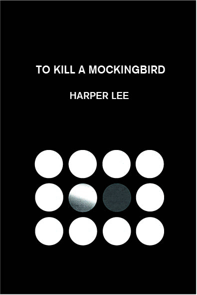
In this design the image the marbles represent different characters within the book, with Tom represented as the black marble, Atticus the black and white striped marble who stands up for Tom and the white marbles reflect the rest of the white community. The concept of oppression is shown within the design by the way the white marbles outnumber the Tom and Atticus. This is also shown by the way the marbles are enclosing around Tom and Atticus. By making 'Kill' italics in the title this creates a harsher feel to the word and emphasises the action within the title. Harper Lee identified with Scout who was quite a tomboy, however despite being quite boisterous Lee became reclusive after the publication of her book. To reflect this idea the use of a Sans Serif typeface, which has a strong form , is used to imply her boyish nature, however the thinness of the typeface is less dominant than the other typography.   


This design plays with the concept of oppression with Atticus and Tom being surrounded. The composition is balanced to reflect how in theory the justice system is supposed to be however it is clear it is not, this is shown by the use of more elements in one half of the cover than the other. The typography is inspired from the opening sequence of the film. Using  a black background allows all the elements to stand out well despite the a photocopy being black. 


This cover explores the concepts of oppression and protection with the white community being much larger than Tom. Atticus is place within the white circle to show how he takes most of the pressure from the white community in order to protect Tom. By placing the circles close together this creates the feeling that Atticus is only just managing to keep them at bay. The typography again takes inspiration from the film, however when placing it within the grid without it overlapping the imagery, 'Mockingbird' needed to be broken down. By making the title larger than Harper Lee this creates a sense of dominance within the typography reflecting Harper Lees quite personality.


This cover focuses on the relationship between Tom and Atticus. By placing the marbles side by side in this way it signifies how Atticus sees Tom as his equal despite what the rest of the community think. It is also represents the positioning of the characters within the courtroom scene within the film. By using a macro photograph and placing the imagery at the bottom of the cover this has created a larger proportion of white space which implies the disparity between the communities. Centralising the typography creates balance between the two marbles creating a flow between three points (the two marbles and typography) which draws your eye around the cover.

Monday, 6 February 2017

Studio Brief 1- Wayfinding - Initial Ideas

Initial idea development 

A feather could mark the spot in which to stand for the best view point. The sign would stand infront of the viewer and a line would extend from the spot up to the correct height on the see through section of the stand, marking the position of the owl on the building behind.


Feathers could be positioned beneath where the owls are like they have moulted. These would be placed on the floor and wall like they were floating to the ground.

Lines could be used to mark the height of the owl in relation to the building, this would separate the area into sections e.g. on the ground, at eye level or up high.  An arrow or something similar could then rise up to the correct point at which the owl is.


Based on the owl of an eye this abstract symbol could be used as a way of marking the spot where the owl is. It would act as a way of pin pointing the location. The use of a circle means that the viewers focus can radiate towards the centre of the circle (Hoffmann) this could work well in drawing the eye towards the spot.

Based on the flight of owls I could use different symbols to represent the height at which the owl is located. For example a perched owl would suggest the owl is low down, an owl rustling its wings would be at mid height and a flying owl would mean the owl would be up high. Here I have simplified the shape of an owl by using a circle as its body and semi circular lines as representations of the wings.

During my research I found that owls have binocular vision which allows them to judge distances very accurately. This idea I thought would functional well as a visual means of creating directional symbols. An owls binocular vision extends outwards allowing for a large scope of vision, it also means that the two eyes work in unison to create a larger field of sight. In these symbols I have used a circle to represent the owls head and the arc to represent the field of vision. The line in between the two shapes shows the line of sight of the bird.


Owls can turn their heads so they can see behind them, so following on from my initial directional arrows  I begun to explore how I could represent patterns of movement. Straight lines represent moving forward with the circles showing intersections in streets. The curved sections play with the idea of an owl turning its head in the correct direction, representing either a left or right turn.

Things needed to move forward:

-        Find information on each of the buildings e.g. historic and architectural
-        Experiment with feathers, physically and creating symbols
-        Photograph the locations of each of the owls

-        Begin to create coats of arms for each of the places 

Studio Brief 1 - Wayfinding - Rationale and Initial Ideas

RATIONALE 


The proposed wayfinding system is for the Leeds Owl Trail which takes the public around the city, discovering owls within the architecture of the Leeds’ iconic buildings. The trail is predominantly used by tourists to the area and acts as a way of exploring the city, whilst also connecting with the heritage of the local area. It is also popular with families as a way for children to engage with their environment in an exciting way. The system is focussed on one of the two trails, The Civic Owl Trail.

The trail follows the path of owls across the city. The owls were originally derived from the Leeds Coat of Arms, which was a symbol of the towns heritage and pride, with the owls specifically originating from the first Alderman’s personal coat of arms. The system development was particularly influenced by heraldry and more specifically, the colour scheme for the design is based on that of the original Leeds Coat of Arms. 

The directional arrows in the system make further reference to the owls, this time physically and more specifically to their binocular field of vision. Positioning the whole of the symbol in the same direction enables this ‘line of sight’ to be further emphasised.


As a concept the system was created by subjectively describing the locations. Using Frutiger and Hoffmans shape meanings allowed the creation of objective representations of the adjectives used, therefore reflecting a sense of the place, either physically or emotionally.


Initial ideas and thoughts for the brief based on research:

Focus on heraldry

-        The owls are derived from the Leeds Coat of Arms. Could I create Coats of Arms for each of the places? These could use physical characteristics of the buildings or be based on the history of the places.

Focus on the Architecture and buildings where the owls are located

-        Have the signs on the sides of the buildings at head height this allows information to be taken in better (Paul Mijksennar). The system should complement the architecture and not distract from it (AM Cassandre). Signs could be created to mimic the sides of the buildings this would allow me to physically ‘mark’ the owls on the signs. If the architecture is the focus what is the best angle from which to see the owls e.g across the street. Could I create standing signs which you look though in order to see the building behind. The sign could be made of clear Perspex with the location of the owl engraved on it so it marries up with the building behind. As a more portable solution I could create a booklet which you could hold up to the buildings when at the viewing spot. This would also be see through with the location of the owl printed ontop.

Focus on owls


-        Create imagery that is based on the habits of owls and how they live/ function. Owls roost up high much like where the owls are situated on the buildings. Feathers could be placed in a pile beneath where the owls are.  Feathers are already quite arrow shaped could these be experimented with to create directional symbols? The system could only function in the dark, as owls do. Could the pictograms glow in the dark?

Saturday, 12 November 2016

Studio Brief 2 - Typeface Design - Initial Idea 4 and Crit Feedback

Display Type


This typeface would reduce letterforms back to their most basic forms whilst still retaining legibility. The letterforms would be stripped back to the most important one or two strokes needed to make up the individual letters. This would be used as a display type or as part of a logotype / branding. 


Removing strokes


In my initial experimentation I was looking at which strokes or parts of strokes could be taken away whilst still keeping the overall form. 


Reducing letterforms to minimal strokes


Working over the top of Univers I was able to explore how I could create letters in the least amount of strokes whilst maintaining the overall form of the letterforms. Some letters could not be reduced to one stroke unless you backtracked over an existing stroke. This could possibly be explored further. I have not joined the beginning of the strokes with the rest of the letterforms to because I want to emphasise the stroke formation rather than creating a solid letterform.


Creating minimal strokes with Univers


Filled letterforms


By redrawing over Univers, this time also using the width of the typeface I was able to create a rough version of the whole typeface. Some letters such as the w,x,y and z looked too disjointed initially because I had broken them down into singular strokes when I could of combined them into one flowing stroke. Overall I need make the weight more consistent where I have ignored serifs and I need to create more rounded terminals on all of the letters to reflect the drawn nature of the type .


Reducing uppercase to minimal strokes


This design similarly explores how I can reduce letterforms to minimal strokes and still be clear. Capital letters have a much more structured formation which I thought would provide the rigidity for more precise 'strokes'. By doing this some letters have become abstract shapes which are still representational. However some cannot be reduced anymore because they are already singular strokes, meaning that the letterforms have stayed the same. 


Defining and adapting letterforms


In order to change all the letterforms I would have to adapt the rule and experiment with taking away sections within the forms to make them different from the original Univers typeface.


Rounded terminals 


To make the letters look more like 'strokes' I have rounded off the terminals to create a softer edge, whilst still retaining the structured formation.


Negative space


Experimenting with the idea of reducing a letter to its simplest form, I wanted to see how a letter could be legible using the negative space around it. This has been used to create letterforms without there being a physical letter. Within my research I found that the interplay between letterform and its background is particularly important. The counterform is not just the a reversal of the letterform but a separate shape which changes alongside other counterforms.  


Representing negative space with lines


Representing negative space with lines


With this experimentation I have used lines to 'outline' the negative space around the letterforms. This has proved to be more minimal for some letters whereas others are effectively look the same as the letterform.


Blocking out negative space 


Following on from this I experimented with blocking in the sections I had outlined. This worked effectively for some letters, however, some which had upright stems lost the negative space on the otherside of them. In order to bring this back into the design and emphasise the thickness of the stems I drew black lines to represent the negative space on the other side of the stems.   


Crit Feedback 


It was suggested that idea 4, where I had reduced the letterforms to minimal strokes, evoked a futuristic feel which I agree with. However I think this will be the primary thing people will associate with the typeface rather than the 'succinct' concept. For idea 1 someone recommended Paul Mijksenaar who creates wayfinding systems to help develop the idea. In other feedback it was said that idea 3 represented the idea of succinct very well however I am unsure how I can go forward with it because it relies on having clear typography, which would mean I would have to use one of the typefaces without changing it. I am not sure how I can adapt the typeface aside from splitting the letters which for me is not changing the typeface enough.


Moving forward

Idea 1 seems to be the most practical out of my initial ideas and I think it would be effective in wayfinding. Idea 2 is quite a strong idea and would allow me to adapt the typeface in a similar way to idea 1. However the use of the typeface for small print, would mean that I would have to make sure it was functional at this size, which could be difficult. Idea 3, although representing succinct well, I am not sure how I could adapt it further to make it my own. The futuristic aspect of idea 4 I think may overshadow the reductionist concept of the typeface.   

I have decided to go forward with the wayfinding typeface, this I think has the strongest concept behind it and is the most functional. The synonyms of 'succinct' will give me a strong basis for adapting my letterforms and will allow me to add personality to the typeface. The grid systems will provide me with a strong structure which will create a uniformity across the typeface allowing it to work in different combinations.

Studio Brief 2 - Typeface Design - Initial Idea 3

For the following two initial ideas I have taken a reductionist approach to letterforms to reflect  my word 'succinct'. Both designs explore the idea of being briefly and clearly expressed by reducing letterforms in different ways whilst try to maintain legibility.


Web Based typeface


This typeface would explore concepts such as 'how much of a letter could be taken away whilst still being legible?' and 'which areas of a letter are most needed in identifying the overall letterform?'. The typeface would be used for web based communication and would only use sections of the original typeface which would allow the viewer to mentally project the rest of the letter to fill the gap.In social media this would be useful as users would be able to say things in less space and abbreviate things even further.


Halving letters

In my initial experimentation I was looking at which strokes or parts of strokes could be taken away whilst still keeping the overall form. My research suggested that the top half of a letter was more legible than the bottom half as there are more visual cues, however when I put this into practice with uppercase letters rather than lowercase letters it was not as effective across the whole typeface. Some letters were very similar and would probably be confused for one another when used.


Halving letters vertically


Using Univers as a typeface means the letterforms are very clear already. When halving the letters most letters are still recognisable, with some such as the E and F taking on a narrower version of themselves. However some letters with such as the Y,T and I have been split down the stem which makes them a different thickness to the rest of the letters, which looks slightly out of place. Things to take into consideration are which halves are used for which letter because some could be mistaken for the same letter e.g. D and O , W and V. 


Mixture of vertical and horizontally halved letters 


By cutting letters both horizontally and vertically this allowed me to have more control over which aspects could be seen from the letter. This I think is more effective than just halving the letters horizontally, as I was able to choose the distinctive qualities for each letter making them more recognisable. I also made sure that there was an equal amount of horizontal and vertical letters to create balance in the typeface as a whole.  


Vertically cut thirds of lowercase letters


Reducing the letters to only a third of the original forms does not work effectively, with some being completely unidentifiable even when put in context alongside other letters. Although this would save the most space the legibility has been compromised. I tried to include the most distinctive features of each letter, however some such as the w and x have only a small section left and letters like the m and n would be easily confused. 


Vertically cut thirds of uppercase letters


Again a third of the upper case letters has not proved much more successful, leaving too little for recognition of each letter.


Larger thirds, vertically cut of uppercase letters
Here I have experimented with using a third of the letter but horizontally rather than vertically. For some letters this is more effective than the vertical version so perhaps these could be combined to make each letter as legible as possible.


Using a serif typeface

In my research it was suggested that lowercase letters are more distinctive than uppercase with serifs enhancing legibility further. Halving the letters in this way, so there was a mixture of both the top halves and lower halves meant the general baseline within the typeface remained the same. This would mean when used in sentences there would still be some structure when forming words.  


Reducing letters to serifs 


Research suggested that serif typefaces are more readable because of the horizontal flow created by the serifs, with this in mind I removed most stroke within the letterforms which left the serifs and terminals. This is effective when there is serifs or terminals at both the top and bottom of the letter as you can mentally fill the gap in between. This also maintains the general form of the letter even without certain strokes. However when put into words I would have to be careful not to have close kerning because the terminals may be confused between letterforms making them less legible. 


Serif typeface reduced to singular strokes 


When removing sections from a serif typeface it emphasises the calligraphic forms within the letters. This particularly works well for letters such as a,b,d which could be easily drawn in one motion whilst still retaining the overall form of the letter. This is not as effective in letters such a the v and w as they are not as distinctive when removing sections so would have to use the original form instead, which is still one stroke.

Studio Brief 2 - Typeface Design - Initial idea 1

Using synonyms of succinct to physically alter the typeface

My first two ideas are based on using synonyms of 'succinct' that can physically be used to adapt Univers such as compact, condensed, short, tight and crisp. From these words I have been able to adapt the starting typeface to reflect these words.

Wayfinding typeface Rationale 

Focusing on the idea of compressing and condensing the typeface I have reduced the x height to be the same as the width of the letterforms, making the type square. There is minimal contrast in the letterforms to make it clear and bold. By removing the connection between the stem and bowl and making the shoulder straight this further emphasises the blocky structure of the letterforms. By using a consistent stroke width and simple structure this will enabled me to create large counters and internal space increasing legibility. The typeface would be used in wayfinding and signage because of its minimal structure and clear letterforms. It would balance functionality with personality.  


Digitally condensed letterforms which I have drawn over


By manipulating Univers so the x height and width were square I was able to roughly see how the typeface would look as a whole. This I thought looked consistent and regulated and allowed the letters to work alongside each other. From this I realised the importance of having a grid system within my type in order to retain similarities in form across my typeface and enable it to work in a variety of arrangements


Univers grid system


To help with designing, I recreated the grid used in Univers to create a basis for the letterforms. Although Univers's x height and width is rectangular I was able to test some of my design alterations.


Light version


By using the edges of the grid as a cut off point I moulded my letterforms around this shape. This has created more straight edges along the sides of the type which I think evokes a sence of the grid restricting and compressing the form. By following the edges of the grid I have also created larger counters and internal space in comparison to the original Univers. By removing the connection between the stem and bowl of letters such as b and g it has created a simpler form. When reading about characteristics of Univers the 'a' has a flat top which is an idea I have explored across the letterforms in terms of flattening the sides and tops of letterforms. I have retained curved aspects that appear in the original universe typeface, however I have standardised the curvature in each letter so it is consistent across letterforms.  


Bolder version


I have experimented with both thinner strokes to create a light type and also bolder strokes which are much bolder. The bolder strokes may be more suitable for wayfinding as they are clearer however I will have to experiment with this digitally to refine the weight of my design.


Type created using square grid 


Square grid systems 


By adapting the original Univers grid to be the same height as it is wide I have created a square format for my letterforms to be manipulated within. My initial experimentation has found that reproducing a double story 'a' within this space may prove to be quite difficult and look quite odd when compared with other simpler letterforms. The lack of internal space once the letterform has been placed within the grid makes it look at little squashed and not very clear so this may have to be changed to a single story 'a'. 

Studio Brief 2 - Typeface design - Initial idea 2

Using synonyms of succinct to physically alter the typeface

Narrow Typeface Rationale


Inspired by Times New Roman this typeface would have narrower letterforms designed to fit more words per line of text. By reducing the width of the letters this will in turn lead to the letterforms having narrower bodies and therefore making it more compact. This narrow typeface would be used for small print e.g terms and conditions or in contemporary magazine columns.


Digital manipulation which was then drawn over


By condensing the typeface on Illustrator, so it was half the width of the original Univers typeface, I was able to draw over the top of this with tracing paper. By compressing the typeface in this way it has distorted the forms in some cases so it was clear it would have to be reworked for it to look consistent as a typeface. 


Grid system used for narrow typeface

Narrow letterforms


By using a similar framework to the wayfinding initial idea I was able to create some more ledgible and similar looking letterforms. Again I have used the grid as a means of 'compacting' the letters and created more consistent curvatures within the forms. With this concept I feel like letters with larger counters and internal space may look stretched because of the proportions of the grid. When digitalised it will be easier to see the effect of this structure at different scales and to see whether it retains its ledgibility.   

Thursday, 3 November 2016

Studio Brief 2 – Typeface Design - Initial Ideas and Crit

Typeface Initial Ideas, Peer Exercise and Crit


In order to begin portraying the idea of succinct within my typeface I identified some key points within my research into the meaning of the word and the typeface Univers, which I want to initially work with. Succinct means to be briefly and clearly expressed and I found many of the synonms for the word were things I could physically do to the type e.g, compact, short, condensed and to the point. Characteristics within Univers which I thought were appropriate to my word, were its moderate x height which makes it quite compact , narrow bodies make the width slightly less and it has short ascenders and descenders. The clarity of the letters will allow me to further exaggerate some of these other characteristics without losing the overall cleanness of the type.

Things I want to try are:
- Minimising the x height further and reducing the width to make the letters squarer and compact
- Shortening the ascenders and descenders to create a more condensed type
- Reduce the width of the type to fit more on a line
- Increase the width of the connection between the bowl of the letter and the stem and flatten the tops of the bowls to make them straighter and therefore blockier
- Experiment with angular ascenders like the ‘t’ to reflect the idea of ‘to the point’
- Making the contrast more consistent across the connections and increasing the counter size


Initial sketches


Initial sketches


Rationale for each initial design

1. Geometric angular ascenders reflect ‘to the point’
Making the contrast similar throughout and increasing the size of the counter makes it more readable 
Thinner weight makes the type finer and more crisp
Ascenders are shortened
2. The width and x height have been compressed to make the design more square
The weight is the same throughout the type with large counters and aperture
Get rid of the connection between the stem and bowl and make the shoulder straighter and more horizontal to give it a blockier appearance
3. Reduce the width to create narrower bodies making it more compact and able to fit more on a line
4. Compress the width and height to make the type more square

The ideas where there is a focus on making the type more square and blocky would be primarily used for display purposes e.g. magazine headers, this I think will provide character as well as clarity in reading, however I will also see whether they could be used as text type on a smaller scale. Where I have suggested making the type narrower this would be used as a text type and would be reflective of the quality within Times New Roman in newspapers, however I would like to experiment with this idea in a sans serif format as a space saving typeface. This would probably be better suited to editorial magazines rather than newspapers as it will have a more contemporary feel. 


Feedback on initial ideas


Points I will explore are:
- Reducing the letters back to their primary shapes by using as few lines as possible. Can I create the letter using one continuous mark?
- Research legibility and the speed at which people read and apply this to my type
- Consider stroke width when reducing the size of the type. Will it still hold its shape?
- Look at a serif type and try reducing this down further to make it more succinct
- Could I combine both upper and lowercase letters to make one alphabet?


Further peer work


Initially we were asked to create as many symbols as we could in a minute to represent our word. We were restricted to a three by three grid which I used to create abstract representations of the word. I focused mainly on the proximity of lines and how a scale could be used to represent distance between the two lines. Another meaning for the word was to encircle, so I tried to represent this by ‘wrapping’ a line around other lines.


Symbols representing 'succinct'


We then had to write our word and synonyms for that word on some paper. This was then given to another person and they had a few minutes to come up with as many responses as they could using a five by five grid. In these we were encouraged to use the grid more by using horizontal, vertical and diagonal lines.


Peer symbol response to 'succinct' 


We were then given another person’s word for which we had to create A’s that portrayed their adjective. I found this to be the easier task out of the three and enjoyed playing about with the structure of the letter. Creating symbols in such a small space of time made it difficult to think of ideas that I could make visual.


Peers portrayal of 'succinct'