Evaluation of the brief
The design has innovative and creative branding which is influenced by the aesthetic of the tin and its functional components. Aller Display Bold for the branding is bold and impactful whilst the use of white creates contrast with the materials and colours used within the rest of the design. Colours used within the design reflect the colour of the product itself (e.g red paint uses red) making the colours easily identifiable.
To create consistency across the metal components within the kit the shapes created for materials on the tin lid are carried across to the corresponding product within the kit e.g. the cut out circles sized for the paint were then used on the paint can branding.
The design is suitable for a young and arty audience with the design having an industrial feel which is contemporary.
The branding has a professional feel to the design. Aller Display Bold has a painted feel similar to brush strokes, with curved edges, with these handmade qualities creating an artistic feel to the logotype. This handmade feel however is refined allowing it to reflect a sense of quality within the design. The use of this typeface stays away from cliches associated with Grafitti e.g. stencil and spray paint typefaces. The logotype is effective at reflecting a more general art aesthetic which reflects the various different materials within the kit.
The design has shelf impact with the use of a minimal and clean design which has a different aesthetic to other tin designs.
A sense of quality and professionalism is created within the design which gives it consumer appeal. The use of sans serif typefaces creates a clean and contemporary feel whilst the use of geometric shapes and a strong structured layout creates a sense of quality and precision within the design.
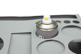
Various production opportunities have been explored within the design. Windows / perforations are cut from the box lid to allow the tin to become a functional object for reuse. The tin would be left in its raw form of brushed silver metal creating an industrial feel to the design which allows the material to be part of the design itself rather than covered up. Debossed areas within the tin lid allow smaller items to be stored. A gloss print finish would be used on the logotype and text to create a sense of quality, whilst a texture would be applied to the coloured circles on the paint and spray paint cans to reflect the idea of the paint being on a wall.
The tin has been designed so that cut outs within the lid of the box act as an organiser for tools when the artist is using their materials on site. Varying sized holes make the design suitable for smaller items such as markers and larger items such as spray paint cans. The rectangular debossed area acts as a palette for mixing paints whilst in the longer rectangular cut out an A4 sketchbook and stencils can be propped up. The minimal use of branding on the tin design and the use of a removable belly band with information on it, makes the tin more of an object fit for purpose rather than just a piece of reusable packaging.
The design positively reflects Street Art as an art form by creating a sense of quality and professionalism in the branding.
Project Evaluation
Within this brief the outcome was to produce a physical mock up of the Street Art Planning tin and branding on other materials. During the brief I found it quite difficult to visually explain to others how the designs would look in real life in terms of production techniques and materials, because the designs were 2D and using colour only. Potentially if I am to do a packaging brief again, physical mock ups of the designs could be more useful in explaining the concept. The use of material textures on 2D designs could help elevate the designs more and better suggest some of the materials that would be used within the design, rather than only using block colour. The mock up was finished to as high a standard as possible with the processes available within the university, however some of the branding potentially isn’t as vibrant as I would have hoped because of the processes used. I enjoyed creating the reusable tin within the brief and considering the functionality of the tin for the target audience.


No comments:
Post a Comment
Note: only a member of this blog may post a comment.