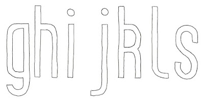
Using synonyms of succinct to physically alter the typeface
Narrow Typeface Rationale
Inspired by Times New Roman this typeface would have narrower letterforms designed to fit more words per line of text. By reducing the width of the letters this will in turn lead to the letterforms having narrower bodies and therefore making it more compact. This narrow typeface would be used for small print e.g terms and conditions or in contemporary magazine columns.
 |
| Digital manipulation which was then drawn over |
By condensing the typeface on Illustrator, so it was half the width of the original Univers typeface, I was able to draw over the top of this with tracing paper. By compressing the typeface in this way it has distorted the forms in some cases so it was clear it would have to be reworked for it to look consistent as a typeface.
 |
| Grid system used for narrow typeface |
 |
| Narrow letterforms |
By using a similar framework to the wayfinding initial idea I was able to create some more ledgible and similar looking letterforms. Again I have used the grid as a means of 'compacting' the letters and created more consistent curvatures within the forms. With this concept I feel like letters with larger counters and internal space may look stretched because of the proportions of the grid. When digitalised it will be easier to see the effect of this structure at different scales and to see whether it retains its ledgibility.
No comments:
Post a Comment
Note: only a member of this blog may post a comment.