Research / Branding Proposal
- Creative Convos is set in lower case creating a relaxed and friendly aesthetic to the design, whilst the use of tight kerning between letters creates a sense of people coming together. These things reflect the atmosphere that the event hopes to create between students and visiting professionals.
- The use of the speech bubble makes a clear and direct link to both the name of the event and how talks will take place during the week for students as well as reflecting the idea of conversations between people.
- The branding has a focus on traditional print and the process of screen printing through the use of halftoned backgrounds and CMYK colour scheme
- The main poster is set on a halftoned black background making it different from the brighter promotional posters.
- The posters that will be given to each speaker will be screen printed with each day being represented by a different colour.
- The use of the different colours for each day creates a vibrant, playful and celebratory feel to the design.
- The hierarchy within the poster places the name of the speaker as the second most important piece of information on the poster aside from the logo. Colouring name of the person the same as the colour of the logo also highlights this information further.
- Screen printing the posters in their current form has however brought up a few problems e.g. screen printing a colour over black does not show up, so only the black shadow is seen.
- They hope to simplify the screen printing process as well, because currently 10 screens are going to be needed to produce all of the posters.
- Intern needs to be removed from the posters as it is just the university who are putting the event on.
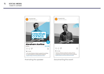
- Within social media posts imagery of the speakers will be layered behind the logo.
- For social media they hope to animate the logo so that it extends to the middle of the post and then back out to the corner of the post, to create a sense of it expanding and retracting
- For social media the posts int he run up to the speakers will have a larger logo and the ones after will have a smaller logo to reflect how the talk has finished and the shadow is therefore shorter.
Other things that are to be considered:
Feedback on the design suggested that the logo within the social media elements could be animated. They also wanted to see some other variations of the speech bubble, perhaps having a slightly different one per day.
Roles within the group:
Megan and Me - Print / Production
Mike and George - Digital / Social Media
Further breakdown of roles:
Megan - developing poster designs and screenprinting with Meg, digitally printing the main poster
Me - Vinyl logos, Schedule, Stickers, door logos and waterbottle stickers
Both of us - helping with each others design elements when needed, producing the elements and putting them up within the Graphics area and generally tidying the rooms


No comments:
Post a Comment
Note: only a member of this blog may post a comment.