Colour schemes
Background Considerations
One of the twelve fundamentals from the The Graphic Designers Electronic Media Manual said that contrast is important within web design. Contrast is created when there are clear differences between items e.g. foreground and background, headline and body text. Research into similar existing websites such as Ebay, Gumtree and Etsy, found that the background colour is usually light to allow the mix of imagery and typography on the eccomerce sites to stand out. In my own design this technique will be used to create a sense of space and allow the imagery to be more prominent than the background making the materials the focus of the concept.
Eco books
Looking at books around the subject of recycling and eco design it was found that light green, dark green blue and white were common colours associated with the subject. If these colours were to be used within the design this would create a recognisable association for users with the subject of being environmentally friendly.
Textures
The categories for the website take influence from the main categories for recycling materials e.g. metal, wood, plastic, paper, fabric and glass. This makes reference back to reuse and putting the focus on the physicality of the materials.
It was considered that the different material categories could be represented physically with materials.
Clingfilm (Plastic)
Paper (Paper)
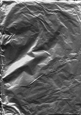
Tin Foil (Metal)
Kitchen Roll (Fabric)
Plywood (Wood)
These could form backgrounds and would act as a way of bringing a textural element to the design, better reflecting the materials that the site will be selling. Keeping them quite neutral possibly just black and white will allow the other elements on the site and the mix of imagery to stand out on the backgrounds.
Scanning different materials into the computer led to mostly monochrome imagery despite being scanned in colour, however this was because most of the materials were translucent or plain in colour.
By raising and lowering the lid of the scanner this effected the contrast of some of the images.
For example when the clingfilm was photocopied with the lid down this led to only some of the texture being visable however when the lid was up this made the background much darker allowing the texture to show up better. Some materials were more textured which meant they didn't lie flat on the bed which affected the clarity in some areas. By placing sheets of paper across the bed this allowed the materials to be weighed down slightly allowing for a clearer image.
Industrial Colours
'Upcycling, also known as creative reuse, is the process of transforming by-products, waste materials, useless, or unwanted products into new materials or products of better quality or for better environmental value'
Definition of By - Product
- an incidental or secondary product made in the manufacture or synthesis of something else.
The process of upcycling something uses waste material from industrial processes so it was considered looking into industrial interior design as a way of visualising the essence of industrial materials.
Industrial interior design features lots of raw materials and products often made from reclaimed sources matching the ethos of the website.
Key features of industrial design
- features are left exposed such as brick walls, pipes, floors, beams and ducts
- warm earth tones and neutrals are popular paint colours in this style of room, in particular grey
- both metal and wood are mixed within the same space as well as in furnishings
- vintage furniture and accessories are used within the spaces as many older designs combined metal and wood
- there is a juxtaposition between the raw and refined, sleek and modern with vintage and classic
- industrial interiors are usually quite minimalist
Using found imagery a colour swatch was created to reflect an industrial feel.


No comments:
Post a Comment
Note: only a member of this blog may post a comment.