Product Photography
Initial Ideas
Product photography could use the brand shapes cut from different materials and arranged in a minimalist pattern to allow the individual qualities of the materials to be shown as well as the range of materials on offer.
- Close up imagery of the materials and framing it so half of the frame is full or a triangular section is missing in the corner would mimic the idea of an offcut. The material name could then be overlayed onto the imagery or the name could be etched into the material itself.
- Using different perspectives within the photography will allow all aspects of the product to be shown.
Cutting down the materials into different shapes and arranging them into compositions could create a strong and textural aesthetic to the branding.
Using a select amount of shapes and materials will refine the photography more.
Leaving areas free so the background comes through could allow the material to create the idea of an offcut through negative space.
- Different angles in imagery allow the qualities of the material to come through
- Layering materials creates interests shadows, whilst perspective creates strong compositions
It was considered that the materials used in the product photographs could be cut to be the offcut shapes used within the branding. These would vary in size within the image and be scattered in appearance, However there would be one large block which would be the focal point of the image. Within this the product name could then be placed within this.
Alternatively the smaller blocks could be arranged in a structured pattern however potentially this would look too uniform when compared with the product.
To make each of the materials stand out perhaps just one of the material shapes could be used within the main product photograph. This would fill the frame making the material the focus of the image. The shape of the product could vary between the two brand shapes so their is difference when put alongside other images.
- Using coloured paper similar to the brand colour scheme and different textured materials behind the products allows contrast to be created whilst also reflecting the use of scrap materials throughout each aspect of the photography
To better reflect the the materials an how they would be sold it was considered that one piece of the material could be cut to the shape of the branding, whilst the other pieces around it are different shapes and sizes (e.g. squares, rectangles etc). This would allow the viewer to get a better sense of the materials in the form they would receive them in.
Alternatively rather then using the brand shape in all the images this could just be on the listing photograph, then when you click on the other images they will be photographs of only the materials. Material District and Present and Correct's style of photography could influence the photographs taken. Material District uses close up images to allow the viewer a better sense of the material, whilst Present and Correct arrange their products in a minimal and organised way creating strong compositions. Their use of different materials with textures and coloured backgrounds for products allows the products to be seen in context, creating a scene, whilst allowing the products to stand out.
Development
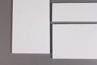
- Arranging and layering offcuts of different sizes and shapes ontop of different materials and coloured backgrounds created minimalist and geometric photographs, however it was difficult to get the lighting right.
Cutting the materials down into different square shapes then arranging them in a structured way with gaps between the items allowed the materials to look high quality, made them stand out on the backgrounds and allow the different qualities of the materials to be shown. Doing the photography in the studio however had its difficulties. Originally the main product photographs were to be shot from above so that the composition of the piece of material could be shown. However I found it quite difficult to get the lighting right and reduce the shadows with the studio lights. Also when taking the images from above it was very difficult to get the composition perfectly in line with the frame, which was making the images look not as good as I wanted.
Final images
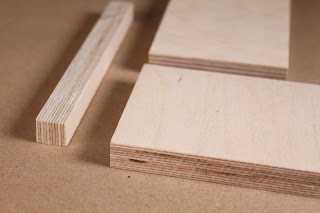
As an alternative I changed the photography style slightly to get more consistent images. The layout of the products was the same as before however this time the photographs were taken at more of an angle and closer up to allow the different qualities, colours and textures of the materials to show through. The lighting in this context worked much better and the products stood out well on the backgrounds.


No comments:
Post a Comment
Note: only a member of this blog may post a comment.