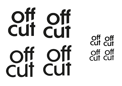
Refinement of Logotype
- Placing the two words one above one another splits the words up like they are two things / two materials
- Adapting the kerning of the u and t so that they line up with the bottom of the f's allows the letters to then be extended to blend together
Vertical Cut Designs
- Different angles of lines were tested to see how much these would cut off each letter and the severity of the angle they would create when cutting the letterforms.
- The lines were made to be the same thickness as the letterforms creating balance and consistency within the design.
- Placing the line at different points within the letterforms created different effects
- Cutting through all the tops of both the u and t really emphasises the idea of the cut through the whole logotype
- Leaving the top of one bit of the u helps to centre the o above it and create more balance within the negative space created by the cut
- Cutting through through the u so that a little bit still exists also fills the negative space and creates balance with the o, however potentially, because of the thickness of the line there is not enough of it to stand out as a shape.
- Leaving the right hand top of the u and cutting the other half doesn't follow the cut line and creates imbalance
- Using a lower angled line means that it cuts too much off the top of the 't' leaving it quite close to the bar in the 't'
Horizontal cut designs
- Horizontal lines were cut across the joins between the f's, u and t using lines were that the same thickness as the strokes in the letterforms
- Cutting straight across the top of the t to follow the spacing between the f and u made the t become a T which creates a unique character within the logotype, reflecting how unique materials can be found from offcut
- Cutting across so that the right hand top of the U extended upwards looks too elongated however when the f is made longer this looks more natural and fitting for an f to be this shape, whilst the right hand side of the u is made lower
- Cutting through the o doesn't work and looks more like a c
- Having longer f's rather than u's and t's looks more balanced.
Further refinements
- The angle of the line determined the severity of the cut, with a more diagonal line creating quite sharp f's
- Moving the line up so that it just took the top off the u meant that more of the t was left, making it more of a legible t
- Cutting the letterforms at different heights created a more irregular feel to the design which would reflect the differences in the materials.
- The designs were tested in different weights to see the effect of this. The bolder typefaces had more impact and solidity which would be effective in reflecting the materials and also allowed the cut through the design to be more visible when made smaller.
- Having longer f's rather than u's was more effective as the U did not then look elongated and slightly off.


No comments:
Post a Comment
Note: only a member of this blog may post a comment.