Photographing Paper Designs and Editing Imagery
To use the imagery as backgrounds within the animation each of the paper designs had to be photographed. To do this an LED light was used to create shadows within the design which would emphasise the forms of the raised paper elements. Having the designs made from one colour combined with the use of raised elements created subtle backgrounds which reflect an aspect of each place without detracting from the illustrations that would be overlaid on to the designs.
Adjusting the lighting allowed shadows to be created to best show off and highlight the forms of the designs.
It was quickly found that it would be difficult to capture the vibrancy of the paper within each of the designs through photographs alone, so the focus was to get the shadows right within the images.
Once all of the designs were photographed the images were edited within photoshop to improve the colour. Initially we tried reverting the images to grey scale then overlaying a coloured box over the top and using the Multiply function to allow the photograph to show through under the coloured box.
We found that doing this with some of the images wasn't always successful. Images that were perhaps darker or had a distinct light source from one side created uneven colouring within the image. This meant that the contrast had to be bumped up within the image to create a more even tone throughout the image. However because of the heightened contrast which made the shadows within the images a lot darker and almost black. This meant the images looked more digital / artificial and didn't retain the quality of the layering of the paper shown within the photographs, which defeated the purpose of making them physically in the first place.
Alternatively we tried editing only the hue and saturation of the images. This allowed some of the colour to be increased within the images however this also highlighted the fact that there was uneven lighting within the images because of the use of the LED light. To cancel this out these areas had to be edited which then meant the colour in these areas had to be edited separately to the rest of the image, which created some inconsistencies in colour within images. Changing the colour in this way also made the shadows coloured rather than grey which perhaps looked a little odd.
Instead it was decided that the images would be retaken in a room with LED lighting in the ceiling. This allowed more of an even lighting to be achieved within the images which meant it was easier to edit the images. The aim was to get the correct shadowing within the images rather than capture the colour of the paper, as the images would then be changed to grey scale and the multiply techniques used with a block colour over the top as this had been effective with previous imagery tests.
Once the images had been grey scaled the contrast and brightness could be adjusted behind the coloured block to allow better definition of the photographs within the images, which also made the colours within the images brighter.
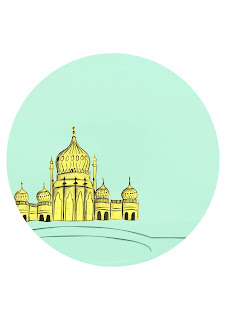
The photographs were then positioned so that the background elements fitted into there designated positions within the circles, which would leave space for the illustrations to be placed inside and the line to flow through without interfering with the illustrations. The circle clock frame was then used as a clipping mask to crop the image down to the shape of the clock face.
Meg's illustrations were then layered over the top of the photographs in Photoshop, again bearing in mind where the line would flow through the image.
In some of the images the illustrations went off the page so these had to be further cropped to keep the circular frame.


