Saturday, 27 January 2018

OUGD503 - Studio Brief 1 - Sustainability Logo (3 Days) - Development

Development of ideas

The final designs were digitalised, contrasting line weights allowed different qualities to be achieved on elements within the logos. Using a thin line for the Earths surface suggests it is within the bubble but further away, so the line creates a sense of depth. Having the thought bubble seed design in the same all in the same line weight creates the impression it has been drawn. Potentially the pencils within the logos could have lines added to make them look more three dimensional rather than using a block colour which make the design look quite flat. In the design with the pencil drawing a seed the thinner line for the seed works well in creating the impression of a pencil line. It was decided that the lit up light bulb design was too busy and the background didn't really add anything to the design 


From research it was found that common colours used within sustainability were green, blue, white and brown. Using colouring pencils and felt tips these colours were used in variations of the designs and allowed for quick experimentation with a palette of colours. Combining the dark shades with light and vice versa works well in creating contrast within the designs allowing elements to stand out. Using different line colours with fill colours broke the designs up and avoided the designs looking too flat. Using lighter colours for the outside lines of the logos did not provide enough definition for the designs as a whole.


The design with the pencil drawing the seed is most effective when there are lines within the body of the pencil. This gives the pencil more depth compared with the flat block colour within the other pencil design. Using black to outline the Earth on the pencil design defines the different elements well. Not outlining the continents on the Earths within the designs makes the shapes look more like they are on the Earth rather than separate from them.


The thought bubble designs are most effective when they are outlined rather than filled as this makes the designs look like more of a symbol rather than an illustration. Using one colour for the whole of the thought bubble Earth design brings the whole design together, where as in the other variations elements possibly conflict too much. The blues within the designs need to be more vibrant and 'truer' blues if they are to be used.


The thought bubble with the leaves works well as a singular colour, however adding fill to the leaves creates a better sense of their form. Varying the thickness of the circles within the thought bubble creates the impression of them physically getting bigger. The designs that use the darkest and lightest greens within the colour palette create the most contrast, in some of the other designs the greens are too similar so wouldn't be very distinguishable at smaller sizes. 

OUGD503 - Studio Brief 1 - Sustainability Logo (3 Days) - Initial ideas

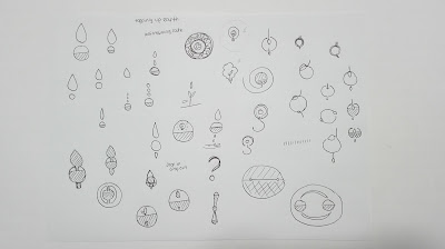
Initial Ideas and Sketches 

Thoughts could be represented through swirling lines with a leaf in the centre to suggest that considering the environment is at the core of thinking. Having a curved swirl creates the impression of an organic thought. Having a looser and more tangled line could suggest a mess of thought.


The idea of creativity being rooted in sustainability could be visualised by placing a light bulb in the ground to suggest it is growing from the soil up. Having a seed within the bulb creates the impression that sustainability is within an idea. 


Using a thought bubble with a scene of a seed growing could suggest someone is thinking about the environment. 

A pencil could be planted within the soil and have leaves to suggest that it is growing representing the idea that sustainability is growing from creativity. Experiments with multiple roots and branches could look clumsy so keeping it simple and just 'planting' the pencil would be more effective.

Sustainability talks about saving natural resources. It was considered that all these natural resources come from the environment which is separated into Earth, water and air. Visualising these through colours within a circle could reflect the balance between them all within the Earth.

Replacing the point in an exclamation mark or question mark would suggest that people need to be aware of sustainability and take time to think about what they are doing, as well as question what impact their actions are having.


Combining the light bulb with a seed creates the impression that sustainability is growing out of an idea. The shape of the plant could form a question mark suggesting that people should be questioning how they are using things. Creating a exclamation mark out of a water droplet and leaf brings attention to the use of natural resources. Making both the leaf and water droplet a tear drop shape and facing one down and on up creates the most effective exclamation mark. Candle light bulbs could replace leaves on a plant to suggest ideas grow from the environment.


Changing the shape of a conventional light bulb into a candle shape look more like a leaf shape, which allows the bulb to become both a bulb and leaf creating the impression of idea and the environment becoming one.  To reflect the idea of creativity supporting the environment and 'holding the planet up' it was considered that the Earth could rest on the end of a pencil. This creates the impression of fragility but support.


To reflect the idea of maintaining natural resources the concept of something filling up and losing material was explored. It was considered that water droplets could fill a circle to create an exclamation mark, however this did not show how things were being taken away. From this it was considered that larger droplets could be going in whilst smaller ones came out creating the impression that more goes in then comes out. However this idea seemed to focus too much on the water aspect rather than the environment as a whole.  Adapting the light bulb idea further, it was thought that the light bulb could be made of a thought bubble with the plant inside, to suggest an idea and a thought within one symbol. Alternatively placing the Earth within the light bulb would suggest that ideas have the planet in mind.  Modifying the classic recycling symbol so that the arrows are made up of leaves would promote the idea of reuse with a focus on why it is necessary. 

Developing Initial Ideas


From the initial designs these were refined to the designs that were the strongest conceptually and had a strong tie to visuals used within sustainability to allow viewers to understand clearly the link between the logo and the topic. 

The designs were fleshed out further and adapted to try and better combine elements.


The growing pencil in the ground idea was explored further by adjusting what was growing form it. Some of the designs explored tree tops for the pencil, of which some were too simplified making it hard to distinguish as a tree. The addition of branches within other shapes made the designs look more like large leaves rather than whole trees. The seeds growing from the light bulbs were thought to be too complicated for a logo and not as original as some of the other ideas. Adapting a circular bulb to look like the Earth made it less clear that the design was actually a bulb, whilst converting a standard bulb look odd. 


It was considered that rather than using a light bulb with a seed in the middle to reflect sustainability within ideas a thought bubble could be used in a similar way however would represent the people are thinking about the environment / sustainability. The design was made to look more organic by drawing the design in a one fluid movement. The thought bubble, was also tested with the Earth in the centre, which worked well because of the continuation of the circular form. Simplifying the pencil so that a seed grows out of the top of it creates a distinction between the two elements rather than over complicating the design. 


Adding leaves and branches to the pencil design became over complicated, instead it was more effective with a few leaves. Having a pencil drawing the seed it was considered could be a good link back to creativity within the university. 


The leaf light bulb was adapted further to emphasise the 'veins' within the leaf. Replacing leaves with light bulbs became too complicated. In order to make the leaves from the candle light bulbs, filaments had to be added and screw bases had to be added to make it clear that they were light bulbs rather than just leaves. However it was considered that these small details would be lost in the design when viewed at smaller sizes. The thought bubble light bulb was better when the shape was simplified, the more curves that are added the ore it looks like a cauliflower floret. It was considered that the seed could be planted in a pot. The question mark shape within the seed could be further emphasised with the original seed in the pot creating the point within the question mark. 


Adding roots to the light bulb makes the design look complicated. Placing the pencil so its dipped in the light bulb reflects how the idea fuels the creativity from which sustainability grows. Placing the pencil downwards into the ground makes the pencil look more rooted than if its the other way round. The idea with the pencil supporting the Earth works well with a small pencil as this creates contrast in scale creating more impact . Having the shavings at the bottom suggests that the pencil has been used, to create work and therefore supporting the Earth. Placing the Earth in the centre of the thought bubble in the same way as the seed, suggests similarly that people are thinking about the environment.

Outlined Designs


Outlining the designs meant that it was easier to see what the designs would look like with different line weights and filled areas.


From the designs 6 were picked, to carry forward. The two thought bubble ideas were used as this simple idea combined both the concept of a thought with sustainability creating a sense of thinking about sustainability. The design with the pencil holding up the Earth links sustainability with the idea of creativity and suggests that creativity can benefit the Earth which it was considered would be a good way of linking the university and what it does with the logo. Adding a line beneath the pencil allows the design to be rooted on the ground making it look more stable. The design with the pencil and seed reflects the link between creativity and sustainability. The seed is growing from creativity, whilst design can also be read as the pencil drawing the seed. The Earth within the lightbulb was considered to be a recognisable concept (seeds / images of the environment are often placed within light bulbs to suggest sustainability) however adapted to use imagery of the Earth. Placing it on a pedistool suggests that it is important and the glass around it suggests it should be protected.


Filling areas of the designs allowed better visualisation of how block colour could be used within the designs and different line weights. 

OUGD503 - Studio Brief 1 - Sustainability Logo (3 Days) - Initial Mindmap / Thoughts

Initial Mindmap and Thoughts on Sustainability 


Key Visuals from Sustainability Images

Footprint 
Water
Light Bulbs 
Plants
Power Cable 
Trees
Arrows 
Earth
Bins
Ideas
Emissions


Key words from the Sustainability Framework


Encourage
Support 
Aware
Responsibilities 
Share 
Knowledge
Impact 
Reduce
Promote
Inspire
Energy efficient 
Carbon Footprint 
Sustainability literate 

Avoiding Depletion of Natural Resources

Sustainability means maintaining a certain rate of use where natural resources are not depleted. This theme suggests that what ever is taken out must be replaced by something else. The idea of things falling out and being put back in could be explored, however more needs to go in then come out. 

Creativity is rooted in sustainability 

The college wants to promote sustainability within the creative institute. Combining aspects of creativity and sustainability would link the design to the university as well as the sustainability and the environment. 

Creativity could be represented by the tools that are used, such as:
paper, brushes, pencils, pens, paint etc 
Pencils or pens would be the most universal tool and relevant for all the course within the university. 


Need to meet the needs of the planet now and in the future 

There is increasing demand for resources so more is needed to keep up with what is being consumed, to maintain resources at a certain rate / level.
Supporting the environment is important for us, this could be described as 'holding the planet up'.


What the college does for sustainability 

The college focuses on reducing CO2, waste and energy.

Sustainability is a way of thinking

Portray the idea that creatives have lots of ideas with sustainability at the core. Sustainability is at the center of creative practice. The framework aims to promote skills, knowledge and understanding of sustainability.
  
Things associated with thinking;
thought bubbles, cogs, light bulbs, brains, questions


OUGD503 - Studio Brief 1 - Sustainability Logo and Identity (3 Days) - Research

Research into Sustainability

Dictionary Definitions

-The ability to be sustained, supported, upheld or confirmed. 
-Environmental Science. The quality of not being harmful to the environment or depleting natural. Resources and thereby supporting long term ecological balance.
-The ability to be maintained at a certain rate or level
- Avoidance of the depletion of natural resources in order to maintain an ecological balance.
-The idea that good and services should be produced in ways that do not use resources that cannot be replaced and that do not damage the environment.
-The ability to continue at a particular level for a period of time.
-The ability to be maintained at a certain rate or level.
- Avoidance of the depletion of natural resources in order to maintain an ecological balance.

Sustainability Framework 

United Nations definition of sustainability 

Sustainable development meets the needs of the present without compromising the ability of future generations 
UN World Summit (2005) formulated the three 'pillars' of sustainability which include social, economic, and environmental factors 


Sustainability in education 

Sustainable development means equipping students with knowledge, understanding, skills and attributes to help environmental, social and economic well being now and in the future.

http://portal.leeds-art.ac.uk/node/4297


Policies and Strategies 

Environmental policy 
Carbon Management plan
Procedurement policy
Waste managment 
Water management
Travel to work
Hospitality / Catering
LTE strategy 
Quality Processes


Sustainability in Leeds Arts University 

The university operates within the sustainability framework, which educates about long term cultural, economic and environmental health and vitality.
The framework uses three levels People, Place, Process which work in conjunction.
There is aspirations within the university to achieve the highest standards of sustainability.
The students sustainability society is called Conscious Creatives.
Most of the BA Programmes engage with the sustainability agenda using live briefs, working with communities and by exploring sustainable materials and techniques.
The collage is a member of The Environmental Association for Universities which aims to inspire, promote and support changes in practice for greater sustainability.


Aims within the college:
Reduce carbon footprint and optimise building infrastructure to be more energy efficient.
Encourage inquiry into sustainability through teaching, learning and research.
Embed sustainability in the curriculum.
Make students sustainability literate by providing skills, knowledge and understanding for a changing world.
Staff and students should be aware of their responsibilities to sustainability.
Encourage engagement with sustainable practices.
Share knowledge of sustainability to raise awareness and participation.

http://www.leeds-art.ac.uk/about-us/sustainability/


Sustainability Statistics in the University 

Energy Consumption 
Both gas and electricity are decreasing 6% year on year. 
There has been a reduction of 18% in the last three years.
Energy has been reduced by individuals taking responsibility for turning off lights, air conditioning, computers and using energy efficient technology.


CO2 Emissions
Has reduced by 23% since 2012 - 13.
They are decreasing by 8% year on year.
The university is improving recycling, sourcing local and sustainable food and installing low energy technology.

Waste Statistics
Waste has decreased by 78% since 2012 - 13.
84% of waste is diverted from landfill and recycled.
81% of waste in 2015 - 16 was recycled which was a 5% increase from 2014 - 15.
9% of waste was used to create energy in 2015 - 16.
98.9% of waste is recycled or reused.

http://www.leeds-art.ac.uk/about-us/sustainability/sustainability-statistics/


Leeds Arts University Sustainability Award

It is open to current students and recognises innovative and outstanding work that is centered around environmental, social and ethical issues with sustainability at the core of thinking and approaches.

http://portal.leeds-art.ac.uk/sustainability


Sustainable energy sources

Solar - Energy from sunlight is caught in solar panels and converted into electricity.
Wind - Wind is turned into electricity using wind turbines.
Tidal / Wave - The movement of tides turns turbines and tidal barriers are also used.
Geothermal - Natural heat from the earth in volcanic regions is used to heat up cold water creating steam, which is then for heating or powering turbines for electricity.
Hydoelectric Power - Energy is created from the movement of water in rivers, lakes and dams.
Biomass - Organic plant and animal waste is burned to create energy such as electricity and heat.
Wood - Trees are burnt to create heat and light.

http://www.bbc.co.uk/schools/gcsebitesize/geography/energy_resources/energy_rev2.shtml

Images and Graphics relating to Sustainability 


Many of the images to do with sustainability use nature imagery based on the environment. Key themes within the imagery are plants, growth, the planet and reduction and recycling. 

There is a common colour palette associated with this topic of greens, blues and browns which all come from the organic nature of the images.


Saturday, 20 January 2018

OUGD503 - Studio Brief 1 - Noughts and Crosses (4 Days) - Digital and Photographic Experimentation

Digital and Photographic Experimentation 

Development of Initial Ideas 

Coin Idea 

Scanned Imagery


It was considered that the coin composition could be made digitally on Photoshop using the scanned images of the different coins. This would allow the elements to be freely positioned and edited. The coins were scanned into the computer however at full scale the coins couldn't be seen very well. Refining the scan area allowed the scan to be focused on the areas of coins making the image larger.


However it was found both as a composition and individually the image quality of the scans was not very good despite being 300 dpi, probably due to the small size of the coins. To move the idea forward photography and digital versions of the coins would be much clearer.


The scanned images however were good reference material for creating digital versions of the coins and allowed me to capture the light and dark shades within the coins to makes them look three dimensional rather than being purely illustrative.

Digital Experimentation


The £2 coin would act as a representation of Sephy and Callum as this combined two shapes into one allowing the different parts to be coloured seperately. Removing the markings from the coins gets rid of the monetry value and allows them to just be coins that are identifiable through colour.


It was considered that the coins for the crosses could either be black or brown, as brown would perhaps better reflect natural skin tone and also would avoid using the colour scheme seen in existing Noughts and Crosses Covers. The coins for the noughts were explored in both pure white and grey, as the grey elevated the design off the white background, whilst the white provided more contrast. Both tomes were used within the £2 outline to reflect Sephy and Callum within one coin.


Sephy and Callum would make up the £2 coin, whilst the black / brown coins are larger than the white / grey ones reflecting how the crosses are seen as more important within the book.  


Enlarging the composition so the coins extend off the page creates a macro view of the coins. This means there is less negative space for the background and allows the focus of the design to be on the coins.


It was considered that the coins could have numbers on them to play with the idea that the crosses were worth more, however there was uncertainty as to wether this added anything to the design that hadn't already been visualised e.g the crosses coins were already larger.


Photographic Experiments 


Full photoshoot of coin images


Using photography to capture the coins I thought might make them more identifiable as coins and therefore more related to the initial quote. Using black and white photography would link the design back to the concept of race however in a subtler way when compared with existing book covers.


Using a similar zoomed in composition to the digital designs, the photographic version had good contrast and definition. Shooting in monochrome also meant that the tones of the different coins were simplified to only two creating similarities between coins without the need for colour. However within this design it is not very clear what all the different coins are because of the zoomed in composition, which makes it hard to work out that there are two groups of coins.


This composition is zoomed out slightly to show the two groups of coins. The contrast in these images has worked well as the two groups of coins are clearly different reflecting race within the book.


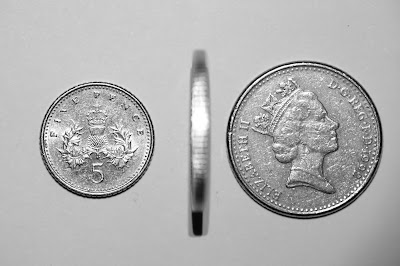
Using the same set up as the last photograph and turning only the £2 over reflects the quote and shows the two sides of the coin.


Simplifying the concept back to only one coin like within the quote creates a bold design. Having one side of each of the coins on each side of the book cover creates the impression of physically flipping over a coin. 


Having the coin on its side so that it aligns with the spine of the cover means that when the book lays flat it will also look like the coin is laying flat. This creates enhances the sense that the coin is being flipped over.


Within the quote it was said that they are two sides of the same coin, however within the book it is clear that this isn't the case. To reflect this it was considered that when the book is flipped over the the other side could be of a different coin with a different worth.


To emphasise the light and dark and differences between the two sides it was thought that adding a direct light over one side would reflect the noughts. However when a harsh light was used this meant the other half of the image was not as visible.


Adding a less severe light to the other side meant that Sephy's cross side was still visible.


Having a dark background around the light sources allowed separation to be created between the two sides emphasising their differences.


Bubble Idea


With the bubble idea it was considered the bubbles could be coloured differently to reflect whether they were noughts or crosses. An x shape would line up over a noughts bubble to suggests it is about to be shot down.


Having outline for the bubbles creates more of a light and airy feel to the design and suggests the transparency of their consistency.


Placing noughts or crosses within the bubbles could better suggest the difference between the two however this could also make the design look more obvious.


Using a dashed line for a popped bubble creates the impression the form is breaking up.


Making it so the daggers just touch the bubble suggests how sharp and easy it is for the bubbles to pop. Placing the dagger vertically above or below the bubble creates draws your eye through the design from the bubble to the dagger and vice versa, however is not reflective of the motion created when popping a bubble.


Once the dagger pops the bubble it continues through into the space it was once in.


Tilting the dagger slightly suggests more of a popping action however the colour of the dagger distracts the eye from the rest of the design.


Using a blue gradient for the background creates a sense of sky and airiness. Using a dashed line for the popped bubble and moving some of the elements makes the bubble look like its falling to pieces. However rather than falling down they should go out first.


(internet sky image)


Continuing with the background idea from the image before, it was considered that an actual sky (internet sky image) would create the effect of bubble floating up into the air. Lowering the opacity of the shapes an text allowed the design to look more airy and light. It was considered that the words within the title could be placed within the bubbles to make it look like they are floating upwards, whilst the design allows the both noughts and crosses to be considered equal.


(internet sky image)


Despite lowering the opacity on the filled circles to make them look more like bubbles the shapes still looked too blocky.


Adding different radial gradients to circles, then layering them up created more of a three dimensional bubble which was more realistic. 


(internet sky image)


Placing the bubbles over the stock image worked well in emphasising elements within the design. The gradients within the bubbles interacted with the sky image in an interesting way and created depth within the design. 

Oil and Water don't mix


Complete Oil in Water Photoshoot


The idea of noughts and crosses not mixing had previously been explored by joining crosses together and leaving the noughts floating within them but not able to join. Instead it was considered that oil and water don't mix in a literal way, which could act as a metaphor for how noughts and crosses are within society. To create the images, oil was placed in a dish that was elevated by placing the the edges of the dish on two stacks of CD's. Black card was placed underneath the dish to create a black background. White acrylic paint was was thinned with water.  Drops of this mixture were put into the oil so that droplets were suspended within the oil. Using a macro lens allowed close up images of the water in the oil to be captured. The colour scheme within the image reflects the noughts and crosses. The rounded forms of the oil reflect the noughts through their shape and colour.


Having rounded forms better reflects the shape of the noughts. This was best created when the water was in beads and hadn't been moved. Using a torch to light the dish meant that a pitch black background could be created whilst highlighting the water drops creating strong contrast between the background and droplets.


Adjusting the lighting so that it was slightly higher meant that a shadow was created on the water droplets creating the effect of a gradient and making the droplets look more three dimensional.


Leaving the water in the oil for too long meant that the droplets started to sink into the oil rather than float on the top. Droplets would also collect together creating larger shapes.


Shaking the dish meant that the water separated into further droplets creating a more intricate and complex design.


Having more droplets made it more obvious that the design was created by mixing oil and water. This it was considered would best reflect the quote.