Collaging with Photocopies
During the the film of To Kill a Mockingbird, in the opening sequence paper is torn which originally had a Mockingbird drawing on it. By tearing the mockingbird this could reference it being killed such as how Tom was, the force that it was torn at shows aggression, pointing to the idea that it was wrong to do so in the eyes of the child.
Visually, when in black and white it could also be used to represent the idea of race with the white in the foreground and black being show through the tear, showing that perhaps the black community are sidelined.
Playing with the idea of representing the struggle of black people within an oppressive white society, photocopies have been used to create a similar look to film still.
With this design there's too many stripes of black in equal spacing suggesting more equality than wanted despite still being a minority in the design. The design should be less balanced to further emphasise the disparity between black and white people.
The tear in this design is too vertical and regulated, it needs to be more organic.
If these designs are cropped down so that the black strip on the far left is cut off the composition will be much stronger. This will leave a predominantly white area with a singular rough black tear, which will better reflect the concept of a minority and more specifically Tom against the white community.
This design only uses a strip of black on the photocopier making the background flat white which I don't think is as interesting as the previous designs because of the lack of texture.
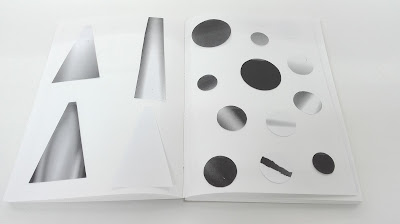
Experimenting with the photocopier to create different designs has led to a range of tonal outcomes which could be interesting when collaged to make images for the book cover. The photocopy's have a grainy textured feel to them which creates an interesting aesthetic which also lends itself to the theme of racial intolerance within the book through the use of a monochrome palette. The photocopies can be used to create the shapes used in the previous adjective designs, which can then be collages to create the complete designs.
A key scene within the book is when Atticus protects Tom, by waiting for the lynchmob outside the jail underneath a light. To create a light / beam like photocopy the lid of the photocopier was lifted up as it was scanning, it was then closed and lifted back up to create the strip of light. Through changing the speed of lowering and raising the photocopier lid this created different sized beams and affected the sharpness of the beam edges.


No comments:
Post a Comment
Note: only a member of this blog may post a comment.